
Brand identity and social partnership for CoffeeGrab
CoffeeGrab · NZ Coffee Pre-Order App · Brand Identity (with Psychoactive Studios) / Organic Social Partnership · FMCG / Tech / Hospitality
Brand identity and ongoing organic social partnership for CoffeeGrab — a New Zealand coffee pre-order app that lets customers tap, grab and go across a network of partner cafes — in collaboration with Psychoactive Studios.
NZ-first
coffee pre-order app launched into one of the world’s most competitive cafe markets
Partner cafes
network model — CoffeeGrab as the platform, cafes keep their character
Ongoing
organic social-media partnership across Instagram and Facebook
Co-built
identity delivered in collaboration with Psychoactive Studios
CoffeeGrab is a New Zealand coffee pre-order app that lets customers tap, grab and go — skipping the queue, customising their order, and earning rewards across a network of partner cafes. Obvious delivered the brand identity for CoffeeGrab in collaboration with Psychoactive Studios, and continues to support the brand as their organic social media partner. The platform is live at coffeegrab.co.nz.
The Brief
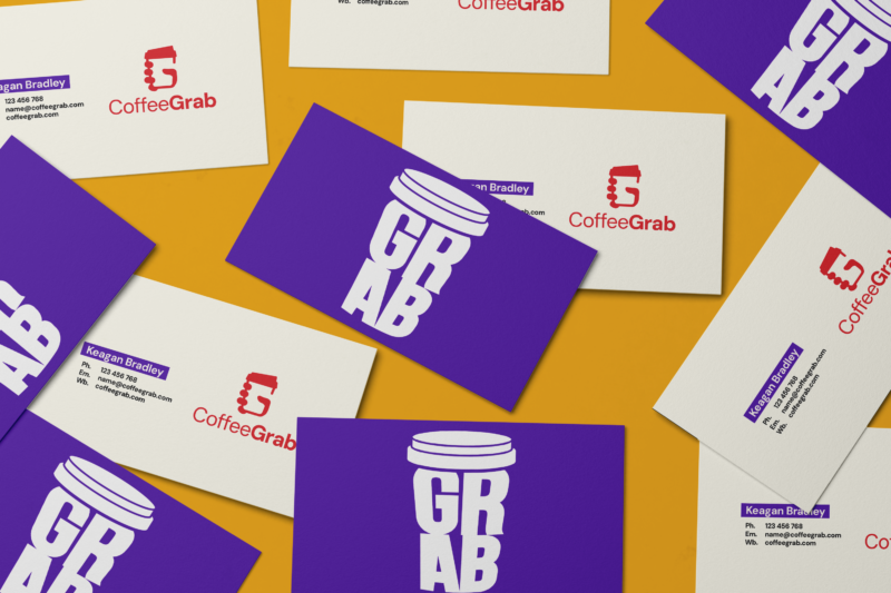
The brief was to launch a coffee pre-order app into one of the most competitive cafe markets in the world. New Zealand has more cafes per capita than almost any country on earth, and Wellington in particular is a city of strong, fiercely-held coffee loyalties. The brand had to do two jobs at once: feel familiar enough that customers would download and use it without friction, and feel distinct enough that partner cafes would see CoffeeGrab as an extension of their craft, not a generic tech platform sitting on top of it.
The Strategic Decision
- Speak in the customer’s language. The category default for delivery and ordering apps is corporate, transactional, slightly cold. CoffeeGrab needed to read like a coffee brand, not a tech brand.
- Respect the cafes. The brand identity had to leave room for the partner cafes to keep their own visual character. CoffeeGrab is the platform, not the host.
- Build for repetition. A skip-the-queue app lives or dies on daily-use loyalty. Every brand surface — the app, the loyalty rewards, the social channels, the in-cafe touchpoints — had to feel like one consistent, repeatable experience.
The Identity
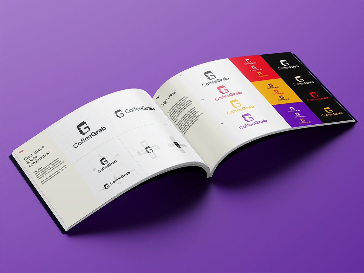
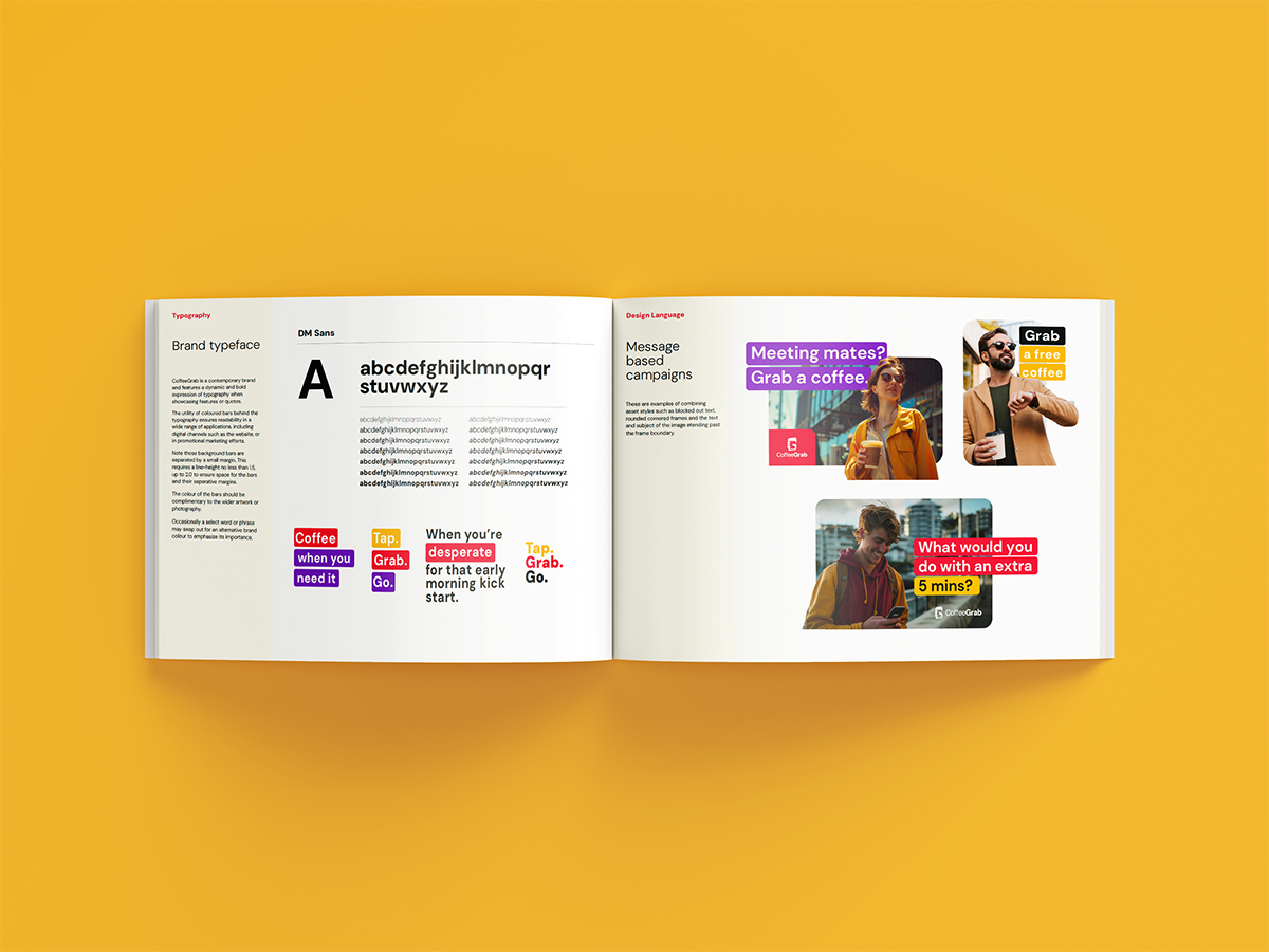
The identity was built in collaboration with Psychoactive Studios: a confident, contemporary wordmark; a colour and typography system that reads as warm and modern without leaning into the “third-wave specialty” aesthetic that would have alienated the convenience-purchase segment; and a layout grammar built to scale across the app interface, in-cafe collateral and social channels.
The Ongoing Engagement
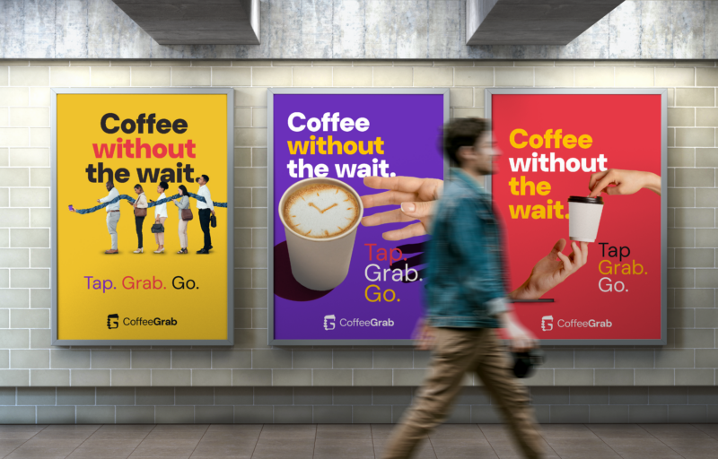
Beyond the original identity work, Obvious continues as the organic social-media partner for CoffeeGrab. The day-to-day brand voice across Instagram and Facebook — the tone of the captions, the framing of the cafe partners, the campaigns that surface new partners, loyalty moments and seasonal drops — runs through us.
Outcomes
What this enables for CoffeeGrab
- A brand that reads like coffee, not like tech. Warm and modern without the corporate-transactional-app default — built to land in NZ’s strong, fiercely-held coffee market.
- A platform identity that respects the partner cafes. CoffeeGrab as the platform, partner cafes keeping their own visual character — the brand wraps the network without overwriting it.
- An identity built for daily-use repetition. One consistent experience across the app interface, loyalty rewards, social channels and in-cafe touchpoints — the system the daily-use loyalty depends on.
- An ongoing organic-social partnership. Instagram and Facebook day-to-day brand voice run through Obvious — captions, partner framing, loyalty moments, seasonal drops.
Launching a tech-enabled hospitality, retail or platform brand into a competitive category?
Obvious partners with tech-enabled hospitality, retail and consumer-platform brands across Aotearoa — designing identity systems built for daily-use repetition and platform-respect for partner brands. If that’s the shape of your work, we’d love to talk.

