
Brand identity for Ferry Holdings Limited
Ferry Holdings Limited · Crown Entity · Cook Strait · Brand Identity & Foundational Collateral · 2025
A foundational brand identity and operating-system collateral for Ferry Holdings Limited — the Crown entity established to deliver the next generation of Cook Strait ferries and the port-side infrastructure they will sail into in 2029.
Mar 2025
Ferry Holdings incorporated as a Crown entity
~6 wks
from SOW signed to brand & collateral delivered
2029
new Cook Strait vessels and port infrastructure enter service
3 Ministers
shareholders: Rail, Transport & Finance
It is cool we have completed the brand, thank you for your help in this.Nicola Martin — Accountability & Performance, Ferry Holdings Limited
(on brand completion, June 2025)
Ferry Holdings Limited was incorporated on 5 March 2025 to take responsibility for two new Cook Strait ferries and the port infrastructure they will sail into in 2029. Obvious was engaged in May 2025 — alongside website partner Grow My Business — to design a brand and a baseline communication system that could carry a high-visibility, ministerially governed work programme from its first day of trading.
The Cook Strait crossing is a piece of national infrastructure, not just a transport service. State Highway 1 and the Main Trunk Line both terminate at it. Freight, passengers, vehicles and rail wagons move between Te Ika-a-Māui / the North Island and Te Waipounamu / the South Island on the same vessels, on a route that touches almost every supply chain in the country. When the future of those ships and the wharves that serve them becomes a Cabinet-level question, the answer is also a question about how Aotearoa connects with itself.
In December 2024, the Government of New Zealand announced a new entity would be stood up to deliver the next generation of Cook Strait ferries and the associated port-side infrastructure. Ferry Holdings Limited was incorporated a few weeks later, on 5 March 2025, with three shareholding Ministers — the Minister for Rail, the Minister of Transport, and the Minister of Finance — and a mandate to enter commercial shipyard procurement and to coordinate the Wellington and Picton port upgrades required for the new vessels to enter service in 2029. The company is privately incorporated but operates to the same expectations of transparency and proactive disclosure as any other public-sector body.
Obvious was engaged, alongside our website partner Grow My Business, to design and deliver the brand identity and the foundational collateral the entity would need from day one — and then the public-facing website it would launch through. The brief was unusual only in its pressure: a Crown entity in establishment mode, a programme of national significance, a small in-house team, a short runway, and the certainty that whatever we produced would be looked at by Ministers, media, suppliers and the public in close to equal measure. The work needed to be foundational in every sense: pragmatic, defensible, and able to compound over the years of delivery still ahead.
A Crown entity stood up from scratch
Most brand engagements begin with an organisation that already has a shape — a leadership team, a website, a tone of voice, a set of inherited assumptions to push against. Ferry Holdings did not. The company was weeks old when we began. It had a name, a board, three shareholding Ministers, a mandate, and the responsibility to begin commercial procurement and infrastructure planning at speed. The brand had to arrive in the same window as the rest of the operating posture: business cards for the people walking into shipyard meetings, letterhead for the first formal correspondence with port companies, a PowerPoint template for the first board paper, a website to publish to.
That establishment context shaped every design decision. We did not have the luxury — and Ferry Holdings did not have the appetite — for a long, exploratory brand process. The proposal we submitted on 19 May 2025 set out a deliberately lean delivery model: brand discovery and direction, two typographic concepts with an optional abstract icon, one refinement round, full lockups and colour systems, a one-page quick guide, and a small suite of operational templates. The Statement of Work was signed on 22 May 2025 with first brand options due eight days later. Final assets were due on 5 June. Collateral on 10 June. The timeline was the brief.
Working at that pace inside a Crown context demands a particular discipline. Every decision needs to be defensible — under Official Information Act requests, under Ministerial questioning, under scrutiny from the press gallery and the public who fund it. We made it clear from the outset that the brand had to be modest, purposeful and unembellished — the kind of identity that could sit on the front of a board paper or the side of a port building without ever drawing attention to itself for the wrong reasons.
The brief: credibility before character
The proposal articulated four objectives for the visual identity, and we held to them throughout. The brand had to earn trust immediately by reflecting governmental purpose, civic responsibility and operational readiness. It had to project professionalism and neutrality, so it could sit alongside the brands it would inevitably be photographed next to — KiwiRail, Interislander, CentrePort Wellington, Port Marlborough, the wider machinery of New Zealand transport infrastructure. It had to support communication clarity across digital, print and physical assets without embellishment or unnecessary stylisation. And it had to be something Ministers, board members, partner agencies and the public could interact with confidently, including in high-pressure or media-visible environments.
In editorial shorthand: credibility before character. The temptation in a maritime brand is always to reach for the obvious — anchors, propellers, hull-shaped letterforms, weather-beaten serifs. Ferry Holdings is not a maritime brand in the marketing sense. It is the corporate vehicle for a multi-year capital programme, and the brand needs to behave accordingly. Our job was to deliver an identity that was distinctly minimal and purpose-led, and that could stand alongside known public brands with dignity. Modest yet confident; functional, but not forgettable.
The other half of the brief was practical. The mark had to scale from a business card to large external infrastructure. It had to read in black and white, in full colour, on screen, on signage, on a corporate document watermarked with an OIA reference. It had to support macron-enabled typography for te reo Māori. It had to be deliverable in every file format an in-house team or external supplier might ever request — SVG, PNG, PDF, EPS, favicon — without further support from us. And it had to come with a usage guide simple enough for someone outside the design profession to apply consistently.
Wordmark, wave, and the path to the chosen identity
We presented the first round of concepts at the end of May 2025. The early explorations took the brief literally: shore-to-shore marks tracing the silhouettes of the Wellington and Picton ports; an anchor-derived monogram folding the letters F and H into a more traditional nautical emblem; a journeys mark using the negative space of a wordmark to express the north-to-south crossing. Each concept came with a colour palette, lockup variations and an in-situ visual look, so the board could see how the mark would behave in real applications rather than only as a logo on a page.
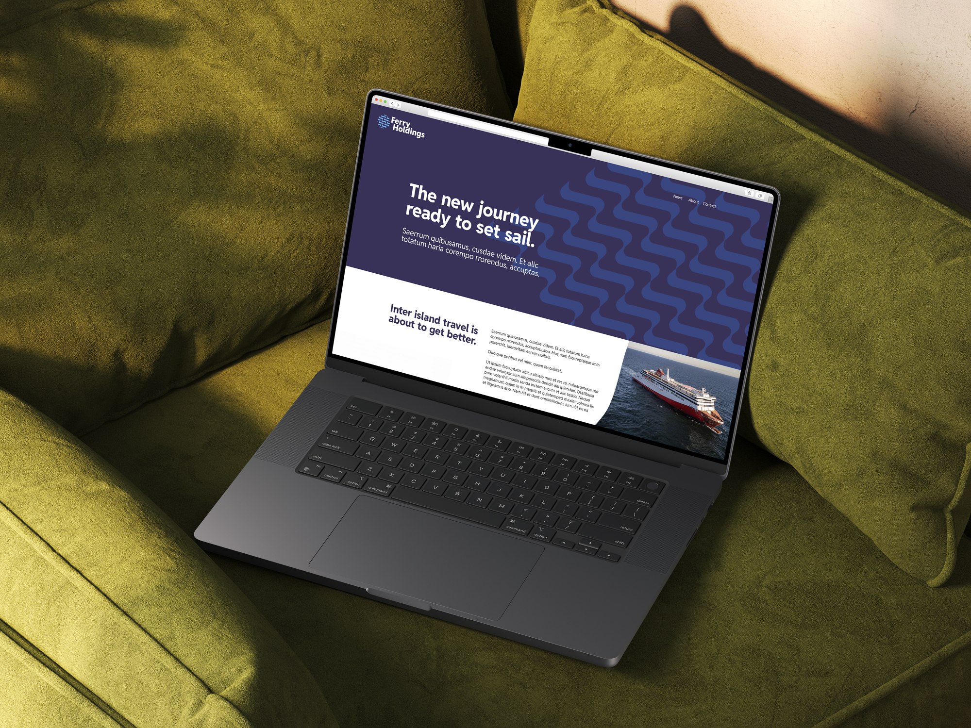
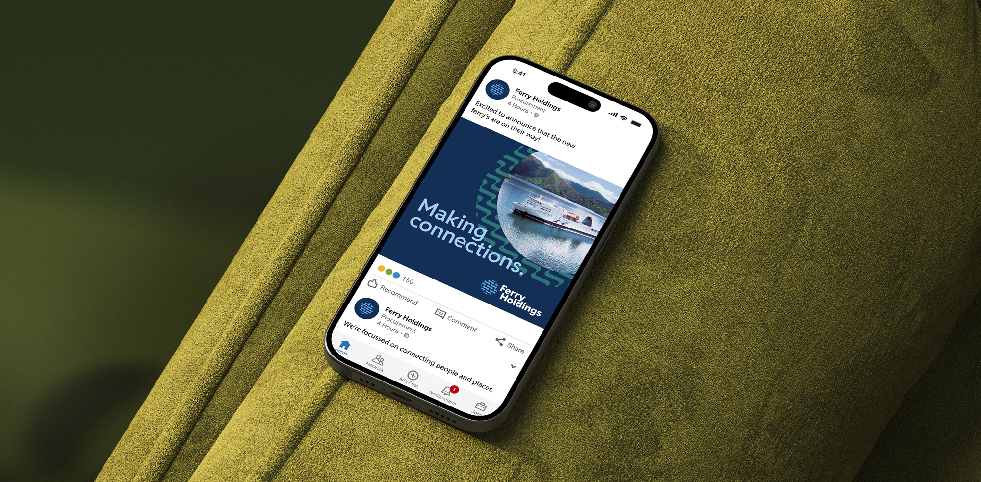
Out of that first round we worked into a second version, and then a third. The final concept set, presented in early June, moved decisively away from pictorial maritime references and into a more architectural, geometric register: a Neue Wave mark drawing on Art Deco symmetry to render movement as ordered structure; a Woven Wave exploring momentum and connection through interlinked strands; and a Bow wash mark inspired by the wash a vessel leaves at its bow — a quiet visual metaphor for forward motion, purpose, and the trail of work already done. The chosen identity carries the Reddit Sans typographic family at its core (Extra Bold for headings, Semi Bold for sub-heads, Light for body) with Segoe UI as the Microsoft-environment fallback for internal documents. The wave element survives as a standalone graphic — a brandmark that can be used as a quiet visual signature across collateral.

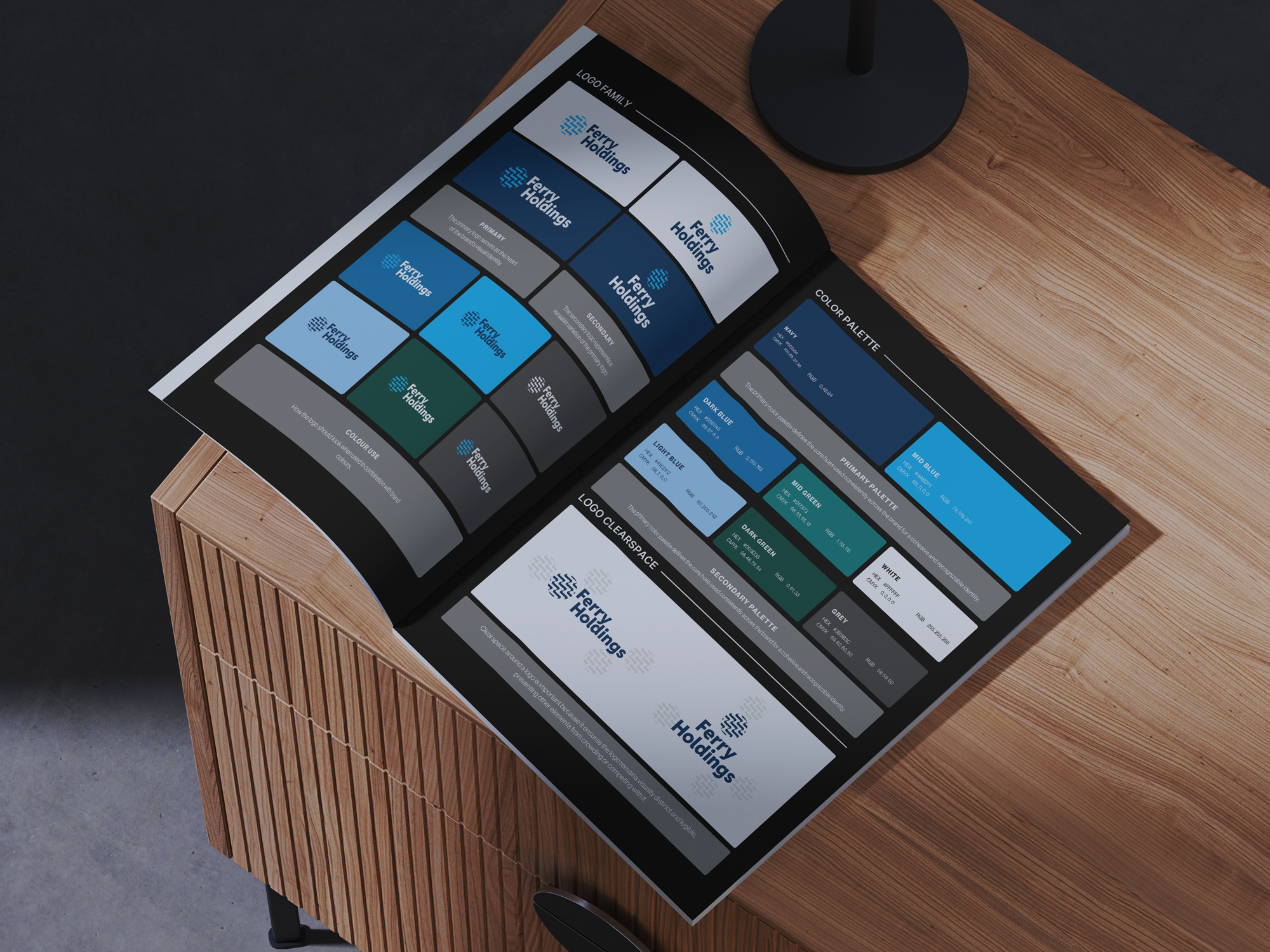
The colour system was built to support that restraint. A primary palette of Navy (HEX #002A54), Mid Blue (#4AB2F1) and White, extended by a secondary palette of Dark Blue (#0367A5), Mid Green (#017373), Dark Green (#003D35), Light Blue (#A1CDF2) and Grey (#3B3B3C). The blues do the heavy lifting: deep enough to read as governmental and authoritative, contemporary enough to avoid feeling tired. The greens give the system somewhere to breathe when an application calls for a different register — sustainability material, environmental reporting, port-side or natural-context imagery — without ever leaving the family.
A te reo–ready, macron-enabled typographic system
A Crown entity in Aotearoa cannot ship a brand that does not properly support te reo Māori. The proposal flagged this from the first page: government-appropriate typography, macron-enabled. In practice, that meant choosing a primary type family that renders macrons cleanly at every weight and size we would use — in a logo lockup, in a heading, in a paragraph of body copy, in a caption on a port map — and pairing it with a Microsoft-environment fallback that does the same in Word and PowerPoint, so internal staff producing documents on standard government-issue laptops would not lose the macrons in translation.
We did not design Ferry Holdings as a bilingual brand in the same way some Crown agencies are. The mandate at this stage of the company’s life is narrow and operational. But the brand is te reo–ready: every typographic decision, every template, every export format has been built so that te reo Māori headings, place names and partner organisation names render correctly the moment the entity needs them to. It is a small piece of infrastructure inside a larger one, and it was non-negotiable.
The wider typographic system follows the same principle of restraint that governs the rest of the identity. A clear hierarchy of heading, sub-heading and body styles. Generous spacing. No decorative weights. No ornamental capitals. The system does not call attention to itself; it lets the content — board papers, ministerial briefings, procurement documents, media releases, OIA disclosures — do the talking.
Foundational collateral: the brand as an operating system
A logo and a colour palette are the visible part of a brand identity; the part the public sees. The part that makes a Crown entity actually function on day one is the operating system around it — the templates, the document styles, the file formats, the usage guidance that lets a small in-house team produce on-brand work without an agency in the room.
For Ferry Holdings, that operating system was specified in the proposal and delivered alongside the identity. A business card design, with print-ready files for individual staff. A Word letterhead template with the lockup, footer styling and macron-safe paragraph styles set up. A PowerPoint deck with title, content and ending slides — so that the first board paper, the first ministerial briefing and the first supplier presentation all carried the same visual language. Three Word templates covering the document types a Crown entity issues most often: a Board Report template, an Agenda and Minutes template, and a hybrid SOI / SPE / Annual Report template ready to take statutory content as the entity’s reporting obligations come due.
Each template was designed for ease of internal editing, with defined heading styles, layout guidance and the same typographic and colour discipline as the brand itself. The intent was to reduce the cost and overhead of every subsequent communication — every board pack, every public document, every procurement-grade briefing — to the lowest sustainable level. Once the operating system is in place, the entity can produce dozens of documents a year on its own, on brand, without needing to come back to us for layout work it should be able to do in-house.
That same operating logic carried into a brand quick guide and a fuller brand guide. The quick guide is a single A4 reference covering logo family, colour palette, clearspace, typography, brand patterns and example applications — the document a new staff member or an external supplier can look at once and use immediately. The fuller brand guide goes deeper into the system for in-house use as the brand matures. Both documents were designed to be defensible under scrutiny: clear, precise, and matching the modesty of the brand itself.
Designed for scrutiny — and for the long programme ahead
Crown infrastructure work has a particular accountability profile. Anything Ferry Holdings publishes — a brand guide, a board report, a media release, a procurement document, a wharf map — can be requested under the OIA, quoted by a select committee, photographed by the press, or referenced in audit. The brand needs to behave well in every one of those contexts, and it needs to keep behaving well for years.
We designed for that timeline. The visual system was built to be applied consistently across digital, print, signage and operational documentation, with file formats and templates that any in-house team or third-party supplier can pick up without extra licensing or specialist software. The identity is deliberately quiet, so that public attention falls on the substance of the work programme rather than on the brand around it. The colour system, the typography and the templates were specified to support a multi-year delivery cycle running through to vessel introduction in 2029 and beyond.
Since the initial brand build, the engagement has continued in the way Crown infrastructure work typically does — incrementally, around the operational rhythm of the entity. Wharf and port mapping for Wellington and Picton has been produced inside the same visual system. Business cards have been issued for the leadership team. Letterhead and Word templates have been kept current. The brand is now several months into the everyday use that any identity has to earn its keep through, and it is doing what the proposal set out for it to do: standing alongside other public infrastructure brands with dignity, and giving Ferry Holdings a clear, robust, scalable base from which to communicate.
Outcomes
What this enables for Ferry Holdings
- A brand defensible under OIA, Ministerial questioning and audit. Modest, purpose-led, deliberately quiet — the kind of identity that sits on the front of a board paper or the side of a port building without ever drawing attention to itself for the wrong reasons.
- A te reo–ready, macron-enabled typographic system. Every typographic decision, template and export format built so te reo Māori headings, place names and partner organisations render correctly the moment the entity needs them to.
- A complete operating system the in-house team owns. Business cards, letterhead, PowerPoint deck, plus three Word templates (Board Report, Agenda & Minutes, SOI / SPE / Annual Report) — everything a small Crown team needs to produce on-brand work without an agency in the room.
- Visual dignity alongside the brands it sits next to. KiwiRail, Interislander, CentrePort Wellington, Port Marlborough — Ferry Holdings now sits in the same family of public infrastructure brands without flourish or apology.
Working in the public sector or on Crown infrastructure?
Obvious is a verified All-of-Government supplier and partners with Crown entities, councils, iwi organisations, public agencies and infrastructure programmes across Aotearoa to design brand and communication systems that meet procurement, transparency and accessibility requirements and still feel like the work of a confident, modern organisation. If you’re standing up a new Crown entity, refreshing one already in flight, or scoping the brand and operating-system collateral a multi-year delivery programme will need — we’d love to talk.

