Brand refresh and Wagtail website for BATS Theatre
BATS Theatre · Kent Tce, Pōneke Wellington · Brand Strategy / Brand Guidelines / Photography / Wagtail Website · Cultural Sector · 2021 — Present
A scrappy, beloved Wellington venue dressed for its next thirty years — brand strategy, guidelines, photography library and full Wagtail website rebuild for BATS Theatre.
30+ yrs
home of independent live art in Aotearoa — emerging and experimental performance
3 spaces
multi-purpose performance spaces under one Kent Tce roof
Since 1976
photography archive dusted off and brought back into the brand
Wagtail
CMS rebuild — built for the small in-house editorial team
BATS Theatre is the Kent Tce home of independent live art in Aotearoa — a three-level repurposed historic building where the country’s emerging and experimental performance work has been made and shown for more than thirty years. Obvious built the brand strategy, the guidelines and a full website rebuild around it.
For decades BATS has been the venue where new work in Aotearoa gets its first audience. A buzzing year-round programme of theatre, dance, improv, stand-up and experimental performance, three multi-purpose spaces under one Kent Tce roof, a season schedule that sets the rhythm of Pōneke’s fringe and emerging-work calendar. Practitioners cycle through BATS at every stage of their careers — first show, first season, first national tour, first return. It is a venue with a culture, not just a programme.
By the time BATS came to us, the brand running underneath all of that had drifted. Materials were inconsistent across applications. The website — a critical channel for season launches, ticketing handoffs and audience-building — was due an overdue rebuild. The visual identity needed to be documented, codified and made portable so a small, busy in-house team could carry it across every touchpoint without re-inventing the wheel each time. The brief was a brand refresh that would honour BATS’s history without freezing it in amber, and a website to match.
A brand strategy that protected the irreverence
The strategic problem was not “does BATS know who it is” — it does, and audiences do too. The problem was that nothing was written down. So when a new staffer drafted a season blurb, a freelance designer laid out a poster, or a company built a show campaign in BATS’s house, every choice was a fresh negotiation with a brand that lived in everyone’s heads in slightly different versions.
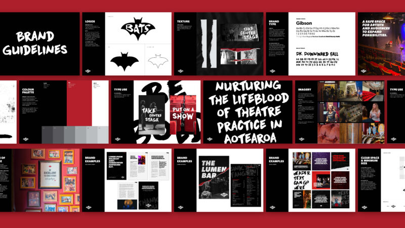
We worked with the BATS team to lock the strategy down on paper. The vision — live art lighting up lives — and the mission — to create safe spaces for artists and audiences to expand possibilities — sit at the top of the document. The three core brand values — bold, accessible, artistic — sit underneath as the test every piece of work has to pass.
A wordmark that stood up to thirty years of posters
The BATS wordmark and icon system was built around a simple rule: it had to hold its own on a foyer wall covered in season posters, gig flyers, photocopied zines and torn ticket stubs — without becoming part of the noise.
We delivered three lockups. The primary logo is the core signature. The icon is the small-format mark — favicons, social avatars. The outlined icon is the occasional-use mark for merchandise and graphic patterns. Each mark comes in a black-and-white primary colour-way and a red secondary colour-way.
Two typefaces, one for working and one for shouting
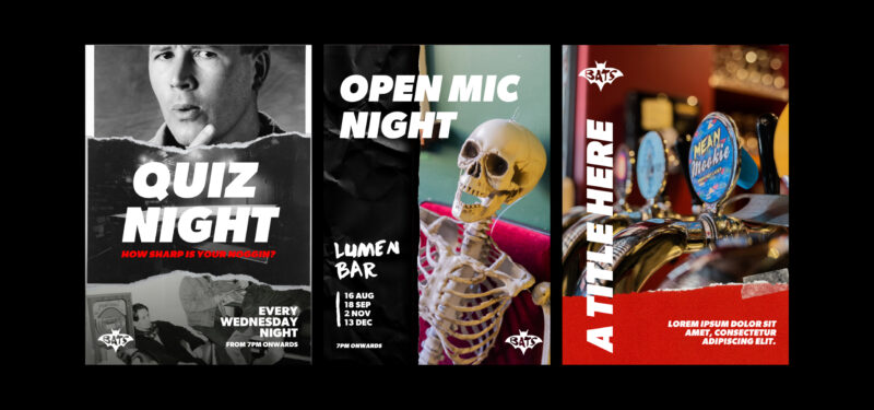
Gibson is the primary face. A humanist sans with a wide weight range — used for body copy, headings, large-scale titles and corporate documents. DK Downward Fall is the display face. A bold, irreverent display typeface used in expressive ways across consumer-facing material and social media. Gibson does the working, DK Downward Fall does the shouting.
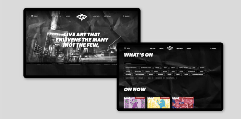
A website rebuilt to be run by a small team
We rebuilt on Wagtail — an open-source CMS chosen specifically because it is built for editorial teams. Goals: a better website admin experience for BATS staff; more opportunities to celebrate the artists at the centre of the programme; improved live-streaming integration (a capability that became non-trivially important during and after the pandemic); and stronger representation of BATS’ kaupapa and history on the front-end. Hosting and ongoing support sit under a signed hosting agreement with us.
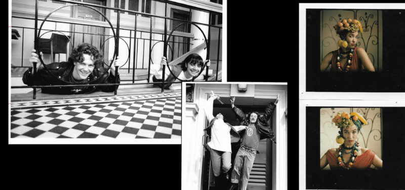
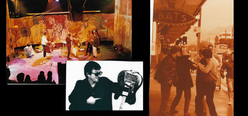
A photographic library, dusted off and brought back into the brand
BATS has a treasured archive of photography that dates back to 1976 — a chronological record of the venue, its companies, its audiences and its building. We dusted those photographs off and built them into the brand. Historic images sit alongside present-day photography across the website and brand applications, telling a visual narrative of the space and the people in it across decades.
Outcomes
What this enables for BATS Theatre
- A brand strategy written down. Vision, mission, three values (bold, accessible, artistic), tone of voice in three registers (consumer, corporate, show-promotion) — the test every new piece of work has to pass.
- A wordmark that stands up on a foyer wall. Three lockups (primary, icon, outlined), two colour-ways (black/white workhorse, red accent), spec’d to favicon scale — built for thirty more years of season posters.
- A type system with two jobs. Gibson for the working (body, programme, corporate), DK Downward Fall for the shouting (posters, hero moments) — the brand can swing between professional and unhinged without breaking.
- A Wagtail CMS the small team can actually run. Better admin experience, live-streaming integration, artist-celebration capability — with hosting and ongoing support continuing under a signed agreement.
Working on a cultural institution or performing-arts venue?
If you are a cultural institution, performing-arts venue, festival or arts organisation thinking about a brand refresh, a website rebuild, or both — and you would like a partner who has done that work with one of Wellington’s most beloved independent venues — we’d love to talk.
