Brand identity for How We Work
How We Work · NZ Neurodiversity-at-Work Brand & Community · Brand Positioning / Visual Identity / Voice / Illustration Grammar / Community Platform · Mission-Led
An end-to-end brand identity for How We Work — a New Zealand neurodiversity-at-work brand and community helping organisations design for the way different brains actually work. Live at howwework.nz.
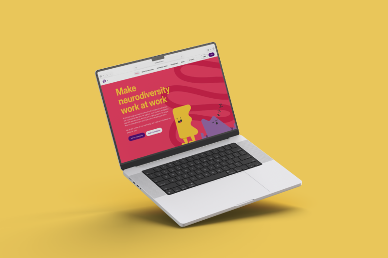
howwework.nz
live platform serving the community and the consulting / training arm
Under-served
neurodiversity sub-category in workplace-design conversation
5 disciplines
coaching, content, community, training & consulting handled in one system
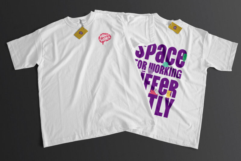
Personified
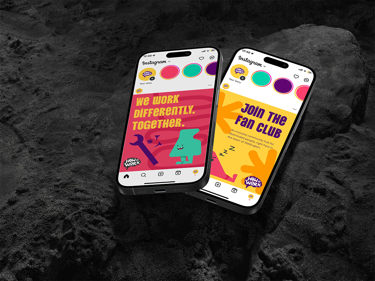
without portrait — abstract forms instead of stock photography
How We Work is a New Zealand neurodiversity-at-work brand and community, helping organisations design for the way different brains actually work. Obvious built the brand identity end-to-end: positioning, voice, visual system, and the bold-colour, abstractly-personified identity grammar that lets the brand show up across community, content, training and consulting touchpoints. The platform is live at howwework.nz.
The Brief
Neurodiversity is one of the most under-served sub-categories in the workplace-design conversation. Existing brands in the space tend to default to either clinical (pathology framing, dim palettes, soft-focus stock photography) or performative (DEI-checkbox aesthetic). Neither lands for the actual audience: the autistic, ADHD, dyslexic and otherwise neurodivergent professionals trying to do meaningful work, and the leaders who want to design organisations that work for them.
The Strategic Move
- Refuse the category default. The brand had to read as confident, intelligent and bright — not therapeutic, not patronising, not earnest in the wrong register.
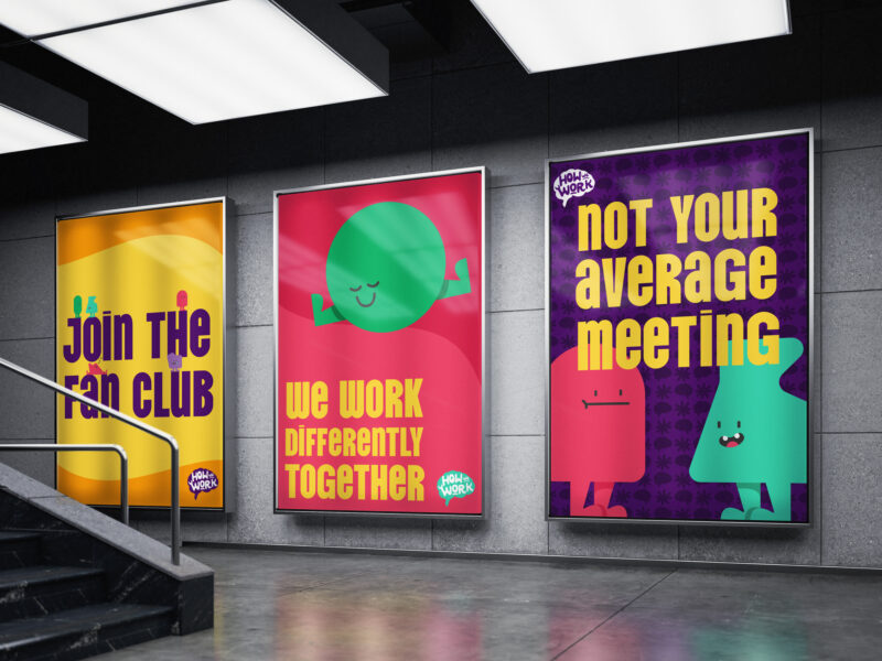
- Personify without portrait. Stock photography of neurodivergent people is its own minefield. The visual system uses abstract, personified forms to express the audience without flattening it into a single image.
- Build for community + content. The brand operates across coaching, content, community, training and consulting. The system had to flex without breaking, and had to be operable by a small in-house team.
The Identity
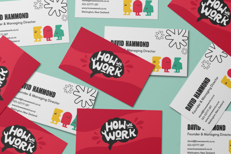
A confident, bold-colour identity anchored on a custom wordmark, a typography pairing chosen for clarity and intellectual seriousness, and a system of abstract personified forms that do the audience-recognition work without locking the brand to a single body, gender or neurotype. The voice is direct, plain-English, slightly drier than the category default — designed to land for an audience that has heard a lot of empty workplace-wellness language and is exhausted by it.
Why this kind of work matters
Mission-led brands that get this register wrong waste their best chance to be heard. How We Work is a useful reference for how Obvious approaches purpose-driven brand work in audience categories that have been historically misframed: through specificity, dignity, and a refusal to perform the cause back at the people it claims to serve.
Outcomes
What this enables for How We Work
- A brand that refuses the category default. Bold-colour, confident, intelligent and bright — not therapeutic, not patronising. The register lands for the actual audience.
- Personified without portrait. Abstract forms instead of stock photography — the visual system expresses the audience without flattening it into a single body, gender or neurotype.
- One system, five disciplines. Coaching, content, community, training and consulting all run inside a single brand system the in-house team can operate.
- A platform live at howwework.nz. Community + content arm operational, serving the audience the brand exists for.
Working in neurodiversity, accessibility, workplace-design or other purpose-driven mission spaces?
Obvious partners with mission-led brands across Aotearoa — building positioning, voice and visual systems that earn the right to be heard by the audiences they serve, without performing the cause back at them. If that’s the shape of your work, we’d love to talk.

