Brand identity and website for Kepla
Kepla · Wellington-Built SaaS · Brand Strategy / Naming / Visual Identity / Brand Guidelines / Web · 2022 — Present
A confident product brand inside a wider digital ecosystem — built for Kepla, a Wellington SaaS platform that lets any business run digital advertising like an expert, alongside sister business Aro Digital in Paradigm Group.
2022→
brand built from the name up, three product cycles in active use
350 yrs
of Kepler mathematics named into the brand — tessellation, networks, geometry
3 channels
Google, Meta, LinkedIn — managed from a single Kepla interface
Best in NZ
Kepla founders’ assessment of the brand work delivered
Obvious connected instantly with what we were trying to achieve as a business, guiding us down a path of discovery and exploration, followed up with a plethora of inspiration and ideas that were then refined over time. If anyone is looking to create a brand that is not only unique, but has a clear sense of longevity and purpose, I’d look to the team at Obvious to do it proper justice. They are clearly the best in New Zealand.Kepla — founding team
Kepla is a Wellington-built SaaS platform that lets any business run digital advertising like an expert — automated campaign creation, budget management and reporting across Google, Meta and LinkedIn from a single interface. Obvious built the brand from the name up, alongside the founders who built the product.
Obvious has worked alongside the team at Aro Digital for years. Aro is a performance-focused digital marketing agency based in Pōneke Wellington — a meteoric local rise that became a meaningful part of the New Zealand digital marketing landscape, and a long-running client and creative collaborator of ours.
Out of that work came a product. Aro co-founders Tim and Jonty, alongside Obvious’s own Jarrod, started prototyping a tool that would let one operator manage digital campaigns across every major channel concurrently — and not just save time, but raise the floor on performance. The original working name was Aro Boost. The brief that came to us was to build the brand that would carry it out of the parent agency and into market on its own terms.
The category it was entering was crowded and visually undifferentiated — a shelf of social-media management tools that all read more or less the same. Our job was to build something that would not.
A name with mathematics in it
The product name needed to do three things. It had to feel future-focused without leaning on the futurism cliché. It had to evoke connection — the product is, at its core, a tool for managing networks of audiences across networks of platforms. And it had to be ownable: a clean .io domain, a defensible NZ trademark, social handles that did not need a number stuck on the end.
We landed on Kepla — a homage to Johannes Kepler, the German astronomer, mathematician and philosopher whose name is also given to several places in Aotearoa, including the Kepler Track in Te Anau. Kepler spent his life mapping the patterns of the night sky and the geometries that connect them. He spent years on periodic and aperiodic tiling — work that, 350 years later, contributed to the discovery of quasi-crystals: beautifully interconnected patterns that do exactly what a digital advertising network does, only on a smaller scale.
It is a brand name with a story under it. It is also a brand name that works in three letters less than the original — useful in a category where the product UI carries the wordmark in a sidebar 24 pixels wide.
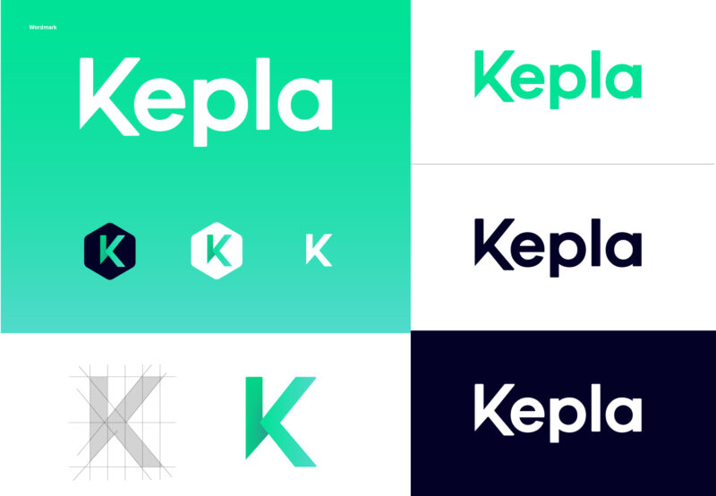
A wordmark with soft corners and sharp edges
The Kepla wordmark is a custom drawing — not a typed-out font choice. Each letter holds a calibrated balance of soft corners and sharp edges, which is the visual translation of the tonal balance the product itself has to strike: future-focused innovation on one side, friendly approachability on the other. The customised K carries the conceptual load. The visual flow moves from a single point outward in all directions — the smallest version of the network the product exists to manage.
The wordmark is paired with a standalone K brand icon, scaled and proportioned to the letterform of the wordmark, used as the favicon, app icon and one-character brand mark in tight UI contexts.

Hexagons and the James Webb Telescope
While Kepla was being developed, the James Webb Space Telescope was launching — the most significant deep-space instrument since Hubble, and a piece of engineering whose iconic tessellating gold-mirror array became one of the defining visuals of the early 2020s. Inspired directly by the telescope’s hexagonal mirrors and their connected vertices, we introduced the hexagon as the brand’s primary geometric device — used to crop imagery, frame content, and build out the brand’s pattern system.
The hexagon does the heavy lifting in the brand. It is the shape that maps to the network metaphor without ever having to spell it out. It works at thumbnail size, scales to a full-bleed pattern, and makes a stock product screenshot look like a Kepla product screenshot with one composition decision.
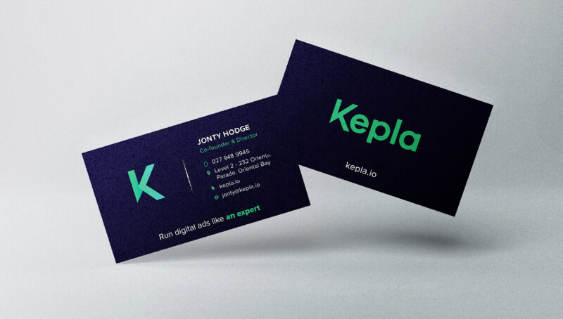
A palette that left the Facebook-blue field
The colour palette was both strategically and thematically driven. Strategically: most of the social-media management category leans on Facebook blue — a category-conformist colour that makes one platform look like another on a screenshot grid. We needed Kepla to stand apart on the same grid.
Thematically: the palette had to carry the space-exploration concept without ever tipping into spaceship cliché. The result is a system anchored on a vibrant green-blue (Galaxy Tint) as the primary brand colour, deep teal and a near-black night-sky navy for backgrounds and weight, and a solar red-orange accent for high-contrast moments and CTAs.
A brand inside an ecosystem
Kepla did not start from zero. It came out of Aro Digital, a sister business in the Paradigm Group that Obvious has worked with for years — and the brand had to do a delicate thing well. It needed to stand on its own feet in market as a SaaS product brand, not as a sub-line of an agency. And it needed to leave the door open to credibility-building cross-references with Aro, with the parent group, and with the digital advertising ecosystem the product plugs into.
The Kepla brand system delivered exactly that. The product brand stands forward — its own name, its own wordmark, its own colour palette, its own UI and design language. The Aro and group connections sit in the background, available as a credibility signal when a buyer wants to know who built it and why it works. Three years in, the result is the answer to the brief. Kepla is recognisable, ownable, and used — by the Kepla team, by partners, and by the customers running campaigns on the platform every day. It looks like itself.
Outcomes
What this enables for Kepla
- A name with 350 years of mathematics behind it. Kepla — from Kepler’s work on tessellation, networks and geometry — gives the product a story that compounds. The .io domain is clean, the trademark defensible, the social handles owned.
- A custom wordmark that holds two tonal registers. Soft corners and sharp edges, paired with a standalone K brand icon for tight UI contexts (favicon, app icon, sidebar at 24 pixels wide).
- A hexagon pattern system that does the heavy lifting. Inspired by the James Webb Telescope mirror array — the hexagon maps to the network metaphor without ever having to spell it out, scales from thumbnail to full-bleed.
- A brand inside an ecosystem. Stands forward as its own SaaS product brand while leaving the door open to credibility-building cross-references with Aro Digital and Paradigm Group.
Working in or alongside scale-stage tech?
If you are a founder, product lead or marketing director at a New Zealand SaaS or tech company looking for a brand identity, naming or web partner who has done the work before, we’d love to talk.

