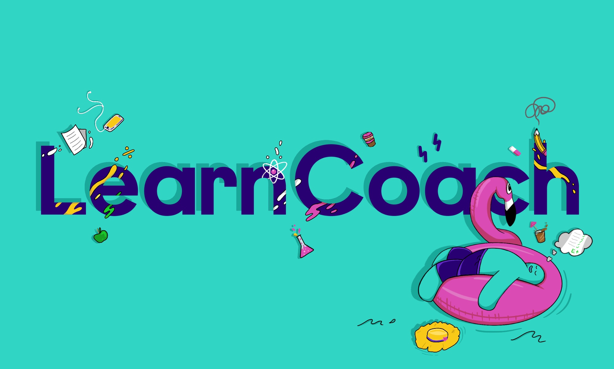
Brand character and system for LearnCoach
LearnCoach · NZ’s Largest Online Tutorial Provider · NCEA & NZQA · Brand Character & Illustration System · EdTech
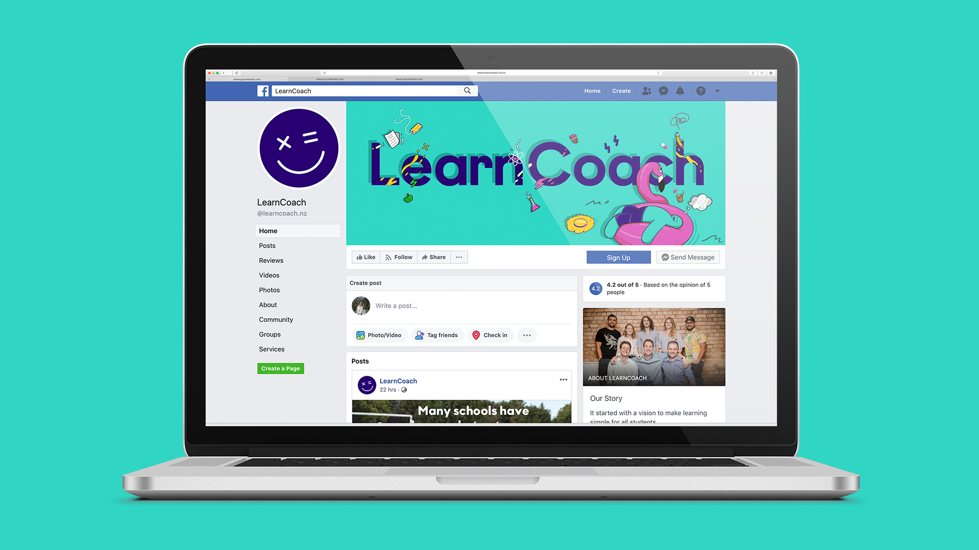
A brand character and illustration system for LearnCoach — New Zealand’s largest online tutorial provider, helping high-school students prepare for NCEA and pass NZQA assessments through bite-size video lessons.
NZ’s largest
online tutorial provider helping students pass NCEA & NZQA
14–18 yo
audience — famously hard to design for, the brand had to land
1 character
drawn once, deployed across hundreds of touchpoints, by different illustrators
Multi-year
creative engine firing weekly on a small content budget
LearnCoach is New Zealand’s largest online tutorial provider, helping high-school students prepare for NCEA and pass NZQA assessments through bite-size video lessons. When LearnCoach came to us, the platform was working: thousands of students were already using it. The brand expression around the platform was not.
The Brief
LearnCoach approached Obvious with a deceptively simple challenge: create a brand character that personified LearnCoach and embodied its values. The character had to capture the platform’s light-hearted teaching style while being a recognisable, repeatable, memorable figure that high-school students would actually want to interact with on social channels, in lessons, and in advertising.
The strategic problem underneath the brief: the audience is famously hard to design for. Students aged 14 to 18 are quick to dismiss anything that reads as patronising, corporate, or too eager. Anything cute is suspicious. Anything serious is ignored. The character had to land somewhere in between, and behave consistently across hundreds of touchpoints.
The Strategic Decision
Before we drew anything, we made three decisions that defined the rest of the work.
- The character should not be human, not be an animal, and not be either gender. Anything more specific would split the audience. A neutral, mixed form let every student see something of themselves in it.
- The voice should be the funny friend, not the helpful teacher. NCEA is high-stakes; the character should defuse, not amplify, the pressure.
- The character should be a system, not an illustration. Drawn once, it would need to scale across hundreds of pieces of content over years, by different illustrators, without breaking.
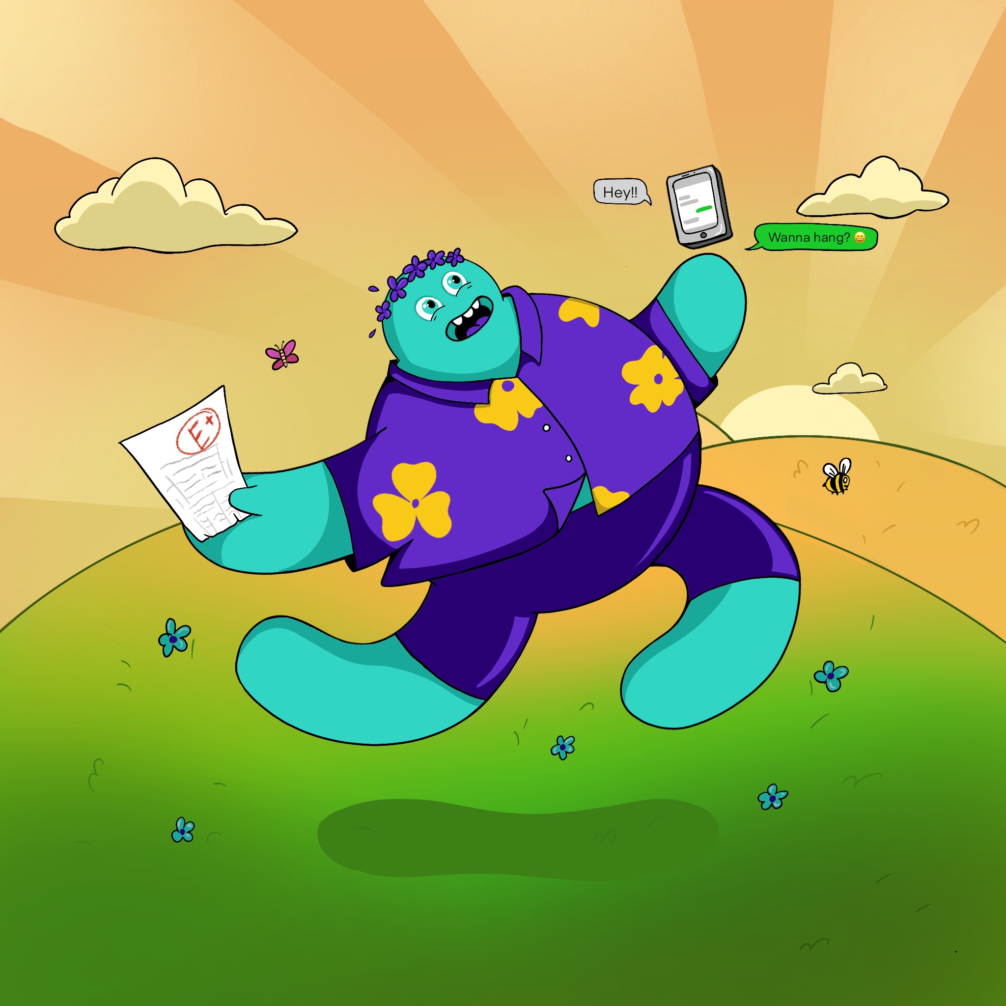
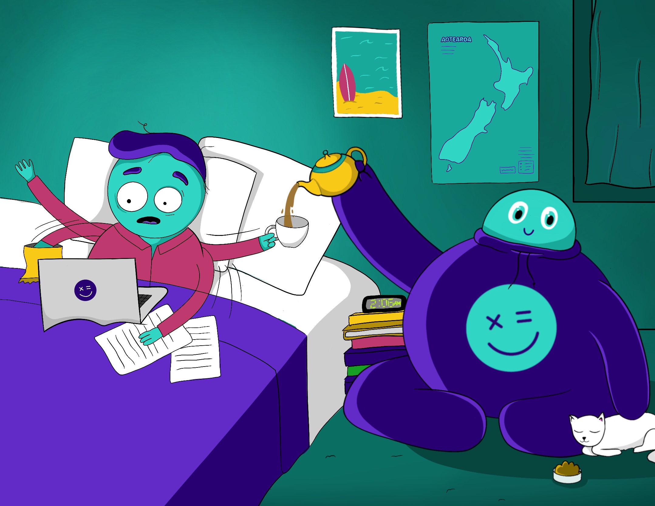
The Character
The resolved character is quirky, adaptable, friendly and youthful, without crossing into kid-territory that would put off senior students. It does not fully resemble a gender, nor is it definitively human or animal. It is a deliberate mixture, designed so that the same form could be drawn doing almost anything: studying, procrastinating, panicking before exams, celebrating after them.
The construction is simple by design. Few rules. Strong silhouette. A face that reads at thumbnail size. The system is intentionally easy to extend — which mattered, because LearnCoach planned to use the character at high frequency across paid social, organic content, in-platform UI, and seasonal campaigns.
The Tone
The character drove the verbal tone as much as the visual one. The brand wrote and spoke in a register that recognised what being a high-school student in NCEA season is actually like: the social trade-offs, the all-nighters, the pre-exam panic, the in-jokes about subjects that nobody admits to liking. The character became the natural voice for those scenarios because it could be shown doing them, not just describing them.
The result was a brand that students recognised before they recognised the LearnCoach name. That is what brand recognition looks like in this audience: the asset arrives before the logo does.
Across the System
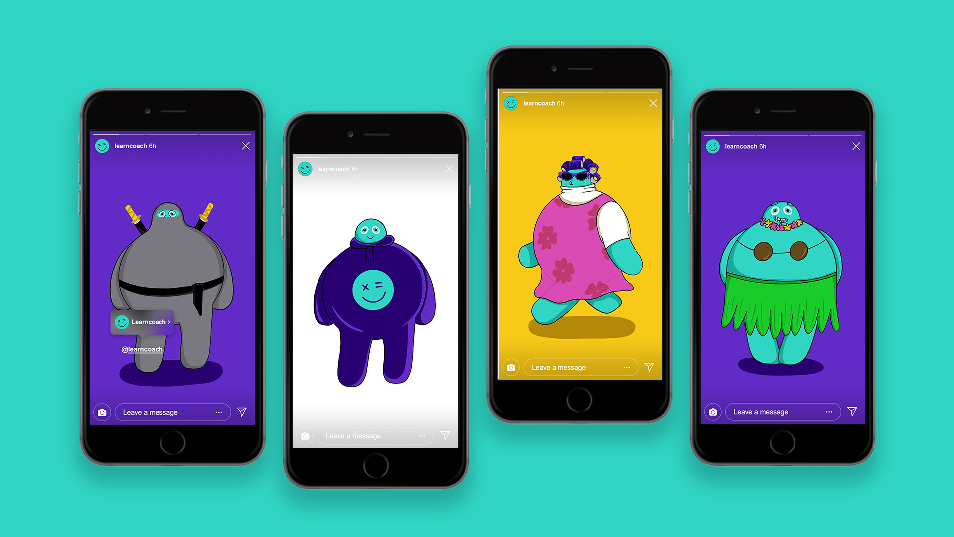
From a single character, the visual system extended into:
- A library of social-first character scenarios, designed to slot into Facebook and Instagram ad rotations without art-direction overhead
- Onboarding and in-platform illustrations that humanised an otherwise utilitarian study tool
- Campaign creative for seasonal moments — exam season, back-to-school, results day — where the character could carry the message without the brand needing to over-explain
- A flexible illustration grammar that other contributors could pick up and extend without breaking the system
Why this kind of work matters
For an EdTech business with a strong product, the brand had been doing the smallest amount of work possible: signalling who the platform was for, but not building any meaningful affinity beyond it. The character closed that gap. It gave the marketing team a creative engine that could fire weekly, on a small content budget, for years. It gave the audience a reason to remember LearnCoach in a category where most products are interchangeable in a student’s mind.
What we did not do, deliberately, was redesign the platform itself. The product worked. Our job was to make sure the brand wrapping it worked just as hard. That distinction — between brand work that respects the product and brand work that overwrites it — is at the centre of how we think about brand strategy.
Outcomes
What this enables for LearnCoach
- A character system that scales. Drawn once, deployed across paid social, organic content, in-platform UI and seasonal campaigns — by different illustrators — without breaking the visual language.
- Brand recognition before the logo. Students recognise the character before they recognise the LearnCoach name. In a teenage audience, that is what brand recognition actually looks like.
- A creative engine on a small content budget. The marketing team can fire weekly content for years — exam season, back-to-school, results day — without needing fresh art direction every time.
- Audience-fit verbal voice. The brand writes and speaks in a register that recognises NCEA reality — social trade-offs, all-nighters, pre-exam panic — landing on the funny-friend side of the line, never the helpful-teacher side.
Working in EdTech, training or audience-of-teens brand environment?
Obvious partners with EdTech businesses, learning platforms and any brand serving a teenage or young-adult audience — designing character-led systems that hold up at high content volume across years. If that’s the shape of your work, we’d love to talk.

