
Brand identity for Matū Group
Matū Group · NZ Deep-Tech Venture Fund · Brand Strategy / Visual Identity / Brand Guidelines / Pitch & Document System / Website · 2021 — Present
An intelligent brand for Matū Group — the New Zealand venture fund investing early-stage capital, governance and commercialisation support into IP-rich science and deep-tech companies.
Since 2021
retained brand partner across identity, system and applied work
4
organisational values articulated: Kaitiaki, Māia, Pono, Aroha
4 ideas
held in the mark: koru, atom, woven forms, community
~300/yr
funding applications Matū fields annually
Our team is really happy with how the rebrand has turned out — one of our team members, with 25 years experience in marketing and sales, said that the brand guideline document was one of the best he’d ever seen. Very concise and clearly communicates to the whole team how we should and shouldn’t use the brand, while also being practical and giving a variety of options.Matū Group — on the brand guidelines delivered by Obvious
Matū Group is a New Zealand venture fund investing early-stage capital, governance and commercialisation support into IP-rich science and deep-tech companies. When the General Partners came to Obvious, the reputation was already there. The brand was not. We were asked to build the visual identity, messaging and applied system that could carry the fund into its next decade — and stand confidently alongside the founders, investors and scientific institutions Matū works with every day.
Matū was founded to address a structural gap in Aotearoa: a steady stream of world-class science and engineering ideas, and not enough patient, hands-on early-stage capital with the technical literacy to back them. The fund’s General Partners — investors and operators with long track records across science and technology commercialisation — had spent the first two years building deal flow, closing the first round of capital, and proving the thesis. The brand had not kept pace.
By the time we were engaged in early 2021, Matū was receiving in the order of three hundred funding applications a year, fielding more high-quality deals than the fund had capacity to back, and presenting to a sophisticated audience of institutional investors, founders, university tech-transfer offices and government agencies. The visible brand did not yet do justice to the work behind it.
The remit was specific. Modernise the identity. Bring the visual system into alignment with the gifted Te Reo Māori name and the organisational values that sit beneath it. Equip a small, capable internal team with a brand toolkit they could actually use — pitch decks, document templates, social assets, a website — without holding everything up for design approval.
A name gifted with intent, and the responsibility that comes with it
Matū is a Te Reo Māori noun: material, matter (in the scientific sense), substance. The name was gifted to the fund and endorsed by Eru George, a respected kaumātua of Ngāti Tūwharetoa and Ngāti Kearoa Ngāti Tuara. The intent was to find a name that embodied and respected the mātauranga of young hi-tech companies — a literal translation never quite captures it, but “of scientific matter and substance” gets close.
The naming gift created both an asset and a responsibility. Matū’s General Partners were clear in our discovery sessions that the organisation is predominantly Pākehā-led, with growing partnerships across iwi and Māori innovation networks, and a long-term commitment to building those relationships intergenerationally. The brand had to honour that. It could not lean on the name as decoration, and it could not sit awkwardly alongside it.
Practically, that meant two things in the visual system. The macron is non-negotiable — the brand guidelines explicitly prohibit displaying the wordmark without it. And the typographic system needed to render Te Reo Māori cleanly, at every size, in every application — from a favicon to an A0 conference banner. Type became the foundation of the identity for that reason, not an afterthought.
Brand values that already existed, made legible
The early discovery work surfaced four organisational values that the partners had been operating to instinctively. Our job was to articulate them in a form the team could share, brief against, and apply.
Kaitiaki — Guardianship. Decisions made with the long view: building a fund the next generation will be proud of, not optimising for the next quarter.
Māia — Bravery. Persistence through the difficult middle of a deep-tech investment cycle, and the conviction to position science and deep tech as a long-horizon asset class.
Pono — Integrity. Acting with professionalism, doing the right thing, and treating every founder, scientist and investor with respect — including the ones the fund cannot back.
Aroha — Passion. Personally invested in the work, not only in the financial return.
These are not borrowed values. They were already there in how the GPs spoke about portfolio companies, how the analyst team described their assessment process, and how the fund had built its relationships with the wider innovation ecosystem.
A brand mark that holds four ideas at once
Most brand marks try to carry one idea. The Matū icon was built to hold four, because each one mattered to a different audience the fund speaks to.
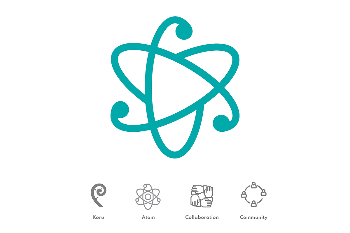
It is a koru — signalling new beginnings and growth, and Kaitiakitanga, an important part of Matū’s brand essence. It is an atom — a visual reflection of the name itself: material, matter, substance. It is a system of woven, interlocking forms — speaking to the collaborative, supportive nature of early-stage investment, where the capital is only the beginning of what a portfolio company actually needs. And it is a quiet reference to community — Matū’s place inside New Zealand’s productive scientific ecosystem, alongside other investors, universities, Crown Research Institutes and government partners.
A palette built from Aotearoa, not from the venture-capital playbook
Investment brands cluster. Most reach for navy, charcoal and one accent — the visual shorthand for trust, experience and conservatism. The brief here was harder: convey trust and professionalism without dating the fund into the same generation as the operators it competes with for deals.
Teal sits at the centre of the palette and is recognised as the predominant brand colour. It is supported by Soft Green, Barley, Navy, White and Super Black. The teal is unmistakably Aotearoan — somewhere between bush, sea and the cooler edge of the Crown Research palette — and works across the full range of applications, from hero web backgrounds to the foot of a corporate stationery sheet.
A pattern system inspired by molecular structure, designed to evolve
The graphic pattern system is one of the more distinctive elements of the Matū identity, and the one we have leaned on most heavily as the brand has scaled. Built from repeating elements and organic shapes — a visual nod to molecular structure and DNA — the patterns sit comfortably across documents, web backgrounds, social posts and presentation slides.
They were intentionally designed to be additive. New patterns can be created within the same aesthetic family as the brand grows, provided line-weight and rhythm are kept consistent. They layer and overlap with adjustable opacity, so the same pattern library can carry both quiet and confident applications without feeling repetitive.
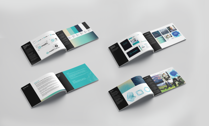
A brand toolkit built for a small team with a long to-do list
A brand identity is only as useful as the systems built around it. The Matū team is intentionally small. The pitch deck was — and remains — the single most-used branded document in the business, with two versions running in parallel: a leave-behind PDF and a presented version.
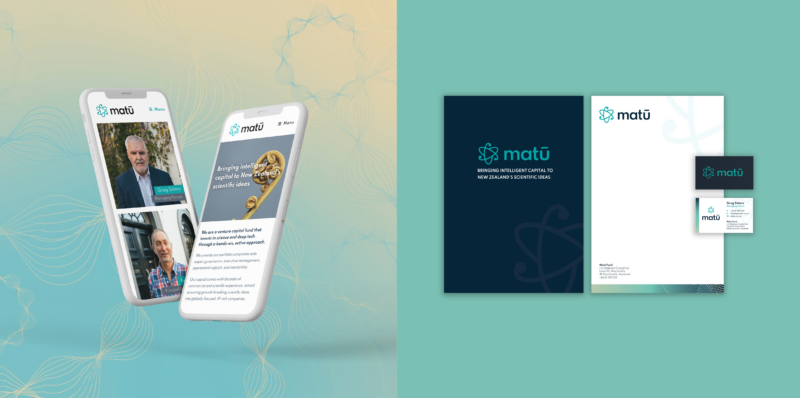
We built out a complete applied system around the identity: pitch deck and document templates that the team can edit and re-cut without coming back to the agency, Canva-compatible templates for social and short-form material, corporate stationery, and a refreshed website that took the brand out of its WordPress-template origins and presented an accurate first impression to the founders, investors and partners arriving via referral.
Matū is a long-horizon fund. The brand was built for the same horizon. Since 2021 we have continued to support the team across applied work as the portfolio has grown — refining the pattern library, extending document and pitch templates, and keeping the website and social system in step with the fund’s evolving thesis.
Outcomes
What this enables for Matū Group
- A brand mark that holds four ideas at once. Koru, atom, woven forms and community — each meaningful to a different audience the fund speaks to (founders, LPs, research institutes, the wider ecosystem).
- A palette built from Aotearoa, not the VC playbook. Teal-led and unmistakably local — convey trust and professionalism without dating the fund into the same generation as the operators it competes with for deals.
- A pattern system that scales as the fund does. Built from repeating elements and organic shapes (a visual nod to molecular structure and DNA), designed to be additive so new patterns can be created within the same aesthetic family as the portfolio grows.
- A brand toolkit a small team can operate independently. Pitch deck and document templates the team can edit and re-cut, Canva-compatible social material, corporate stationery, and a refreshed website — no agency in the room for everyday production.
Building a brand for a venture fund, deep-tech company, or research-led business?
If you are a founder, GP, MD or chair building a brand for a deep-tech business, a research-led company, or a fund investing in either — and you would like a partner who has done the work for a New Zealand venture fund operating at a serious level — we’d love to talk.

