Direct-to-patient brand launch for MSQ Health
MSQ Health · Direct-to-Patient Healthcare Brand Launch · Paradigm Group Integrated Offer · September – November 2024
How Obvious Brand Partners and long-time collaborator Aro Digital — now both part of Paradigm Group — took MSQ Health from concept to a live direct-to-patient (DTP) healthcare brand at msq.health, in approximately six weeks.
Brand strategy and identity by Obvious. Performance marketing by Aro. Delivered as one coordinated team, on one brief, on one timeline — a case study in launching into one of the fastest-emerging segments in NZ private healthcare, anchored to public-system wait-time pressure and the global rise of DTC health.
6 wks
From strategy refinement to live brand, live website & live marketing programme
1
brand strategy underpinning brand, web and marketing in parallel
4
domains coordinated for NZ, generic and UK markets
2
Paradigm Group teams (Obvious + Aro) as one
The launch opportunity — and the brand brief inside it
By mid-2024 the structural conditions for a New Zealand direct-to-patient healthcare brand were unambiguous. Public-system wait times for elective procedures remained a sustained policy issue. The bowel-cancer screening programme was making colonoscopy capacity visible to the general public. NZ’s private health insurance footprint provided a large, identifiable audience that could pay directly for elective care. Internationally, the DTC health category had already produced category-defining operators — Hims & Hers, Ro, Maven Clinic, Mira — proving the consumer appetite for direct-access models was real and durable.
The opening for MSQ Health was specific: a New Zealand brand that could attract patients into private elective procedures directly, with a patient-pooling operating model that batched patients of like procedures together to improve both access and service economics. Initial procedure focus: colonoscopy. Forward roadmap: additional procedure categories, with UK domain reservations signalling international scaling intent from day one.
The brand brief was unusually demanding. The new brand needed to read as clinically credible (because patients are trusting it with their bodies) and consumer-warm (because the whole proposition is the absence of intimidating institutional gatekeeping). It had to launch alongside a website and a paid digital programme on a six-week runway. And it needed to scale — across procedure categories within NZ and across markets internationally.
The MSQ Health brief had two needs sitting on top of each other — clinical trust, and consumer warmth. The brand had to make both work in the same logo. And the launch had to move at the speed the market was rewarding.Obvious Brand Partners — on the MSQ Health brand brief
Obvious + Aro — long-time collaborators, now both Paradigm Group
Most new healthcare brands launch slowly because they’re stitched together from independently-procured vendors: a brand agency, a separate web agency, a separate marketing agency — each with their own scoping cycle, contracting overhead, and incentive structure. MSQ Health avoided that drag because two of the three core launch capabilities — brand and performance marketing — were delivered by teams who’d already been collaborating closely for years.
Obvious Brand Partners and Aro Digital have a long history of working alongside each other on joint client engagements. That collaboration now sits formally under the Paradigm Group umbrella — the New Zealand business group that’s brought together a small cluster of specialist marketing and creative capabilities — but the working pattern significantly predates the corporate structure. MSQ Health is what that working pattern looks like in a healthcare launch:
The brand discipline
- Brand strategy refinement — sharpening DTP positioning into brand language
- Brand Considerations document — strategic context, competitive read, identity territory
- Visual identity system — heart-and-gradient mark, lock-ups, variations
- Colour and pattern system — coral-pink-to-blue gradient + pattern library
- Formal Brand Guidelines document
- Production-ready logo files for forms, business cards, operational tooling
The performance marketing discipline
- Audience strategy — identifying right patient segments for launch
- Paid digital programme — Google, Meta, LinkedIn campaign architecture
- SEO foundation — keyword strategy aligned with brand work
- Conversion measurement — instrumentation for 90-day optimisation
- Post-launch performance optimisation of the campaign mix
The accumulated muscle memory between Obvious and Aro is what made the six-week timeline real. Brand strategy decisions fed marketing strategy in the same week they were made. Logo files arrived in marketing assets within hours of approval. Audience hypotheses from Aro’s team sharpened the brand voice in real time. Three sequential vendors would have taken three months; two long-time collaborators operating as one team did it in six weeks.
Brand strategy — the thinking before the mark
Most healthcare brand launches fail at strategy before they fail at design. They start with logo concepts and try to back-fit a strategy afterwards. They default to the visual conventions of the category — corporate teal, clinical white, friendly-doctor stock photography — without interrogating whether those conventions still earn attention.
The MSQ Health engagement started in the opposite direction. Before any creative work began, Obvious refined the strategic articulation around four anchor questions. Every subsequent creative decision was made against these four answers.
Who is the audience, really?
Not “people who need a colonoscopy.” The DTP audience is more specific: people with the means (private pay, private insurance, employer benefits) and the posture (proactive, time-poor, willing to pay for convenience and certainty) to choose direct access over the standard public referral chain. Roughly 1.5M+ NZ adults have private health insurance, but the launchable audience inside that is narrower: health-conscious adults aged 35–60, often with personal or family experience of public-system wait times, primed by years of global DTC health marketing to expect a consumer-grade experience.
What’s the category convention — and what would it cost to break it?
A quick visual read of NZ private healthcare reveals a tight category cluster: corporate teal-to-blue, clinical whites, serif headings with sans-serif body. The convention exists because it works — it signals trust, competence, clinical seriousness. But every brand using the convention looks like every other brand using the convention. The decision: retain the clinical-trust signal inside the brand system, but lead with consumer warmth in the places competitors lead with clinic.
What’s the tonal range the brand has to occupy?
The brief required two qualities most healthcare brands treat as opposites. Clinical credibility and consumer warmth — engineered into the same mark, the same colour system, and the same voice. Clinical AND warm, not clinical OR warm.
What’s the scaling logic?
The brand starts with colonoscopy but is designed for additional procedure categories. International domain reservations — msqhealth.co.uk alongside the NZ domains — signal the long view from day one. The brand system had to scale gracefully across new procedure categories and markets without forcing a sub-brand rebuild each time. The mark had to be one thing that could mean many.
Creative development — concept, iteration, lock
Visual identity development ran across the first two weeks of October 2024, led by Senior Designer Scott Copeland. The work moved through concept exploration, mark development, and refinement — each phase driven by the four strategic anchors and tested against real applications, not abstract aesthetics.
The strategic logic pointed quickly toward a combination of two visual directions: a heart symbol given modernity, depth and differentiation by a gradient. The heart did the category-legibility and warmth jobs. The gradient did the differentiation and modernity jobs. Together, they did the dual clinical-credibility-meets-consumer-warmth job the strategy demanded.
The decisive heart variant
A slightly asymmetric, soft-cornered geometric heart that read clearly at small sizes (favicons, social avatars, business card scale) while having enough character to hold the gradient at larger sizes. Symmetric variants felt corporate; fully organic variants felt soft to the point of unserious. The asymmetric-but-geometric middle path held both qualities.
The decisive gradient rotation
Early gradient explorations were vertical — pink at the top, blue at the bottom — which created an unintended top-down hierarchy that read as warmth above, clinic below. Client feedback prompted a rotation: the gradient was repositioned to move diagonally, giving the mark a sense of motion and forward direction rather than stacked hierarchy.
Logo direction was locked on 9 October 2024 — three weeks from formal kickoff. By that moment, the brand was already integrated into the homepage design, and the hex codes and asset library had been handed off to the digital build team and to Aro Digital’s launch marketing team. From lock to live: another two weeks.
The brand system — built to scale
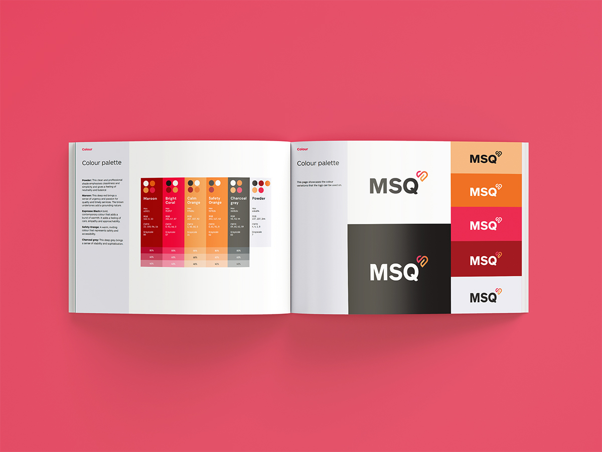
Colour — a gradient that earns its keep
The primary brand expression is a coral-pink-to-blue gradient, with supporting solid colours and a derived pattern library. The strategic logic compounds. The pink end differentiates MSQ Health from the corporate-teal category default — a recognisability win measurable at distance, at small scale, and across scroll-stopping social formats. The blue end maintains the clinical-trust signal NZ private healthcare audiences are conditioned to read. The gradient itself becomes a brand asset that scales beyond the logo — into website hero treatments, marketing creative, signage and patient-facing communications — so the brand is recognisable even when the logo isn’t visible.
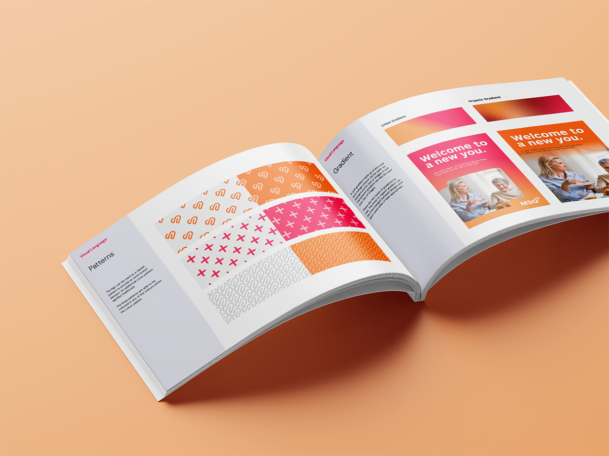
Pattern — derived from the mark, applied as system
A derived pattern system extends the gradient and heart language into supporting graphic elements that can populate large surface areas (web headers, brochure spreads, social backgrounds) without competing with the primary mark.
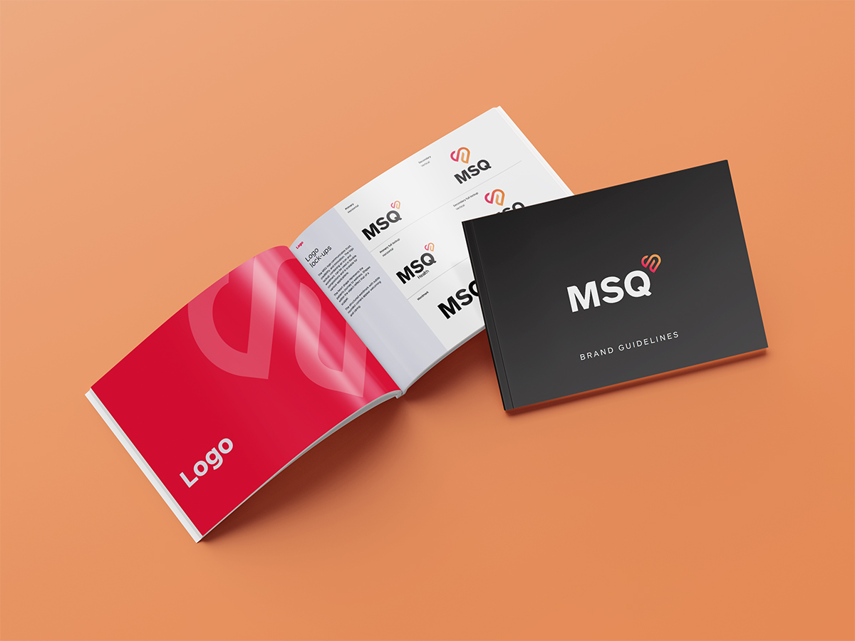
Brand Guidelines — the reference document
All of the above was codified in a formal MSQ Health Brand Guidelines PDF (delivered 16 October 2024). Logo lock-ups, colour values across digital and print, pattern usage, typography, photography direction, voice principles, and application examples. The document is the single source of truth the MSQ Health team and external suppliers work from — delivered before launch so the website build, the marketing creative and the operational tooling all ran from one consistent reference.
The six-week timeline
- Mid September 2024 · Strategy
Direct-to-patient strategic intent and patient-pooling operating model sharpened into brand language. Naming and domain strategy confirmed (msq.health primary; NZ and UK domains reserved). Aro Digital’s marketing strategy begins in parallel.
- Late September 2024 · Considerations
Brand Considerations document delivered. Strategic context, competitive read of NZ private healthcare, audience hypotheses, identity territory.
- Early October 2024 · Identity
Heart-and-gradient mark concepted, iterated, refined. Multiple gradient angles and heart shapes taken to the client. Transparent backgrounds, business card applications, homepage application all produced for in-context evaluation.
- 9 October 2024 · Lock
Logo direction locked. Hex codes and brand assets handed off to digital build team. Aro Digital begins finalising launch campaign creative against the locked brand.
- 16 October 2024 · Guidelines
Formal Brand Guidelines PDF supplied. Logo variations, colours, patterns, application guidance.
- 23 October 2024 · Live
msq.health goes live. Approximately six weeks from formal kickoff to live brand and live website, with Aro Digital’s launch marketing programme switched on in parallel.
- Early November 2024 · Rollout
Production-ready logo files supplied for forms, business cards and operational tooling. Aro Digital’s paid campaigns optimising against early performance data. The brand now in active use end-to-end.
Outcomes
6 wks
strategy refinement to live brand, live website & live marketing
1
brand strategy underpinning brand, web and marketing in parallel
4
domains coordinated for NZ, generic and UK markets
2
Paradigm teams (Obvious + Aro) as one
What the brand work enables
- Launch-ready production. Within days of guidelines delivery, MSQ Health was producing branded forms, business cards and operational tooling without further design support.
- Marketing-aligned brand. Because Aro Digital’s audience and channel hypotheses fed back into brand voice in real time, the brand and the launch marketing speak the same language at every touchpoint.
- Scale-ready architecture. The patient-pooling operating model and the brand are designed to extend beyond colonoscopy into additional procedure categories without rebuilding the identity. The UK domain reservation signals the long view from launch day.
- One logo that does both jobs. Clinical credibility and consumer warmth co-existing in the same mark.
Why Obvious + Aro works for healthcare launches
Healthcare brand launches have a particular failure mode: by the time the brand is signed off through three sequential vendors, the operating model has moved, the regulatory landscape has shifted, the team has lost launch momentum, and the brand and the marketing are speaking past each other because they were built in different rooms by different people on different briefs. The Obvious + Aro working pattern was built — over years of joint engagements before either business sat under the Paradigm Group umbrella — to neutralise that failure mode.
For MSQ Health — and for any NZ healthcare brand looking to launch into the direct-to-patient category — the pattern is clear: brand strategy, identity, brand guidelines and performance marketing operating as one team, on one timeline, from one brief. Obvious on brand. Aro on marketing. Both now Paradigm Group. Six weeks to live.
Launching a healthcare brand — or a DTP-adjacent consumer service?
Obvious partners with healthcare, allied health and DTP-adjacent consumer services across Aotearoa — including the long-term Wellington Medical Group partnership covering five general practices. Combined with Aro Digital’s performance marketing under the Paradigm Group umbrella, we deliver brand and launch marketing as one team. See MSQ Health in the wild at msq.health, or start a similar launch with us.

