Nuture
Growing more than numbers
Nurture is everything an emerging business needs to feel financially secure. Their drive is simple: support impactful businesses to grow in a sustainable way. Nurture is all about good people, transformative results and a love for number-crunching!
It was a pleasure to work alongside Sheridan, the mastermind at the helm of Nurture to rebrand his pride and joy and we couldn’t be prouder of the results!
Sheridan’s strong sense of values were central to our branding process, as they are in his business operations. Our branding and strategic direction echoed his down-to-earth and approachable personality, reinforcing the strong sense of trust Sheridan instils in his client relationships.
Following our collaborative design framework, we developed a rich visual identity that truely reflects the team behind Nurture as people who care and ensure their clients feel secure and guided in their capable hands.
It’s all in the name
When Sheridan approached Obvious with the task to refresh the identity of Seedling Consulting; he left nothing off the table. This open-minded approach and trust in our expertise allowed both organisations to design the best possible, long-term business solution.
Reflecting on the name; we agreed that the original name Seedling felt limited, or targeted toward a start-up audience. While smaller businesses remain an audience, we sought a name that more effectively positioned their services more inclusive of a wider scale of enterprises. ‘Nurture’ was the obvious choice.
It effectively implies the care and consultancy provided – regardless of operational size, with the intent to grow and sustain. Beyond this, it honours Sheridan’s sensibility for environmental sustainability.

Beyond the name
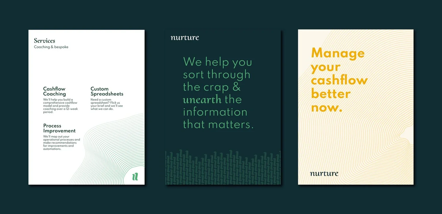
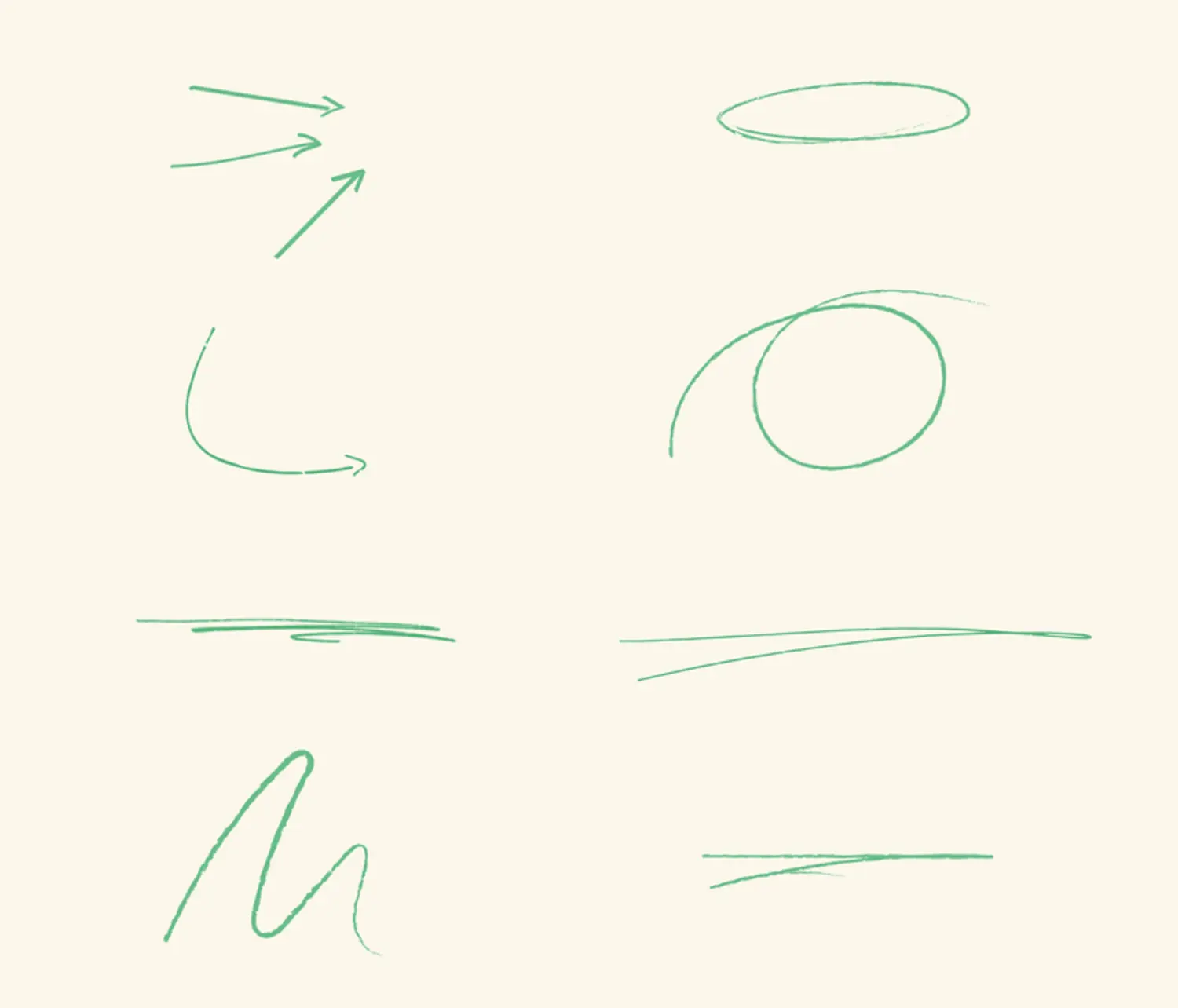
Inspired by natural elements and forms and a digital aesthetic familiar to fin-tech, we developed graphic patterns that add expression, movement and energy.
The inclusion of hand-crafted touches, like a scribble, underline or circle were important additions to provide a human touch – after all, we’re humans talking to humans, aren’t we?
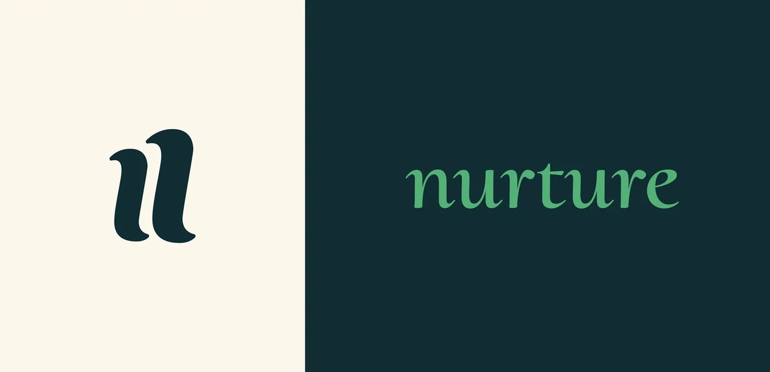
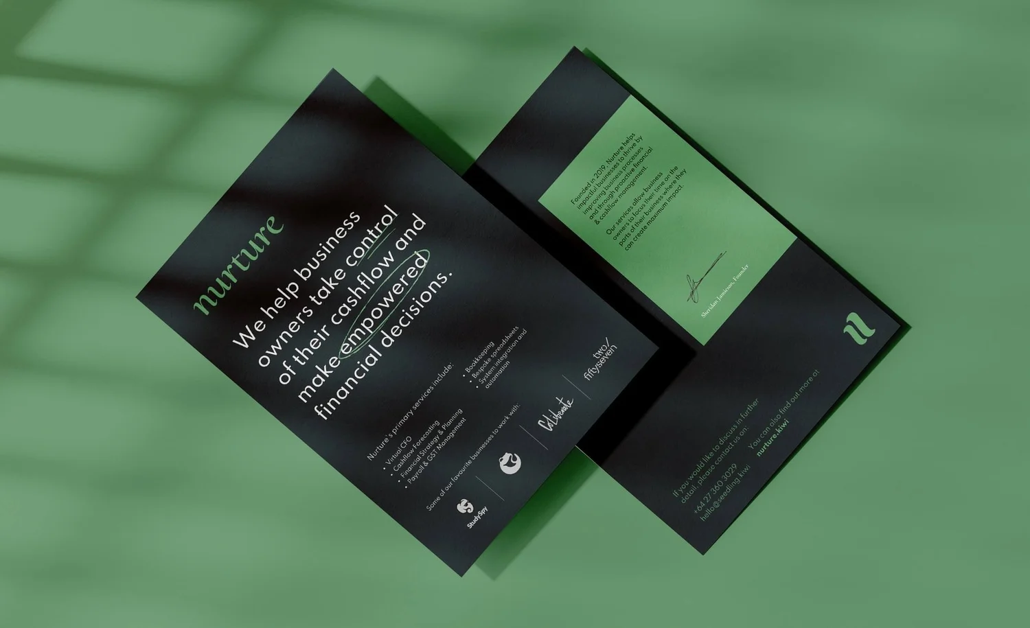
The icon mimics the soft curves seen in the nurture wordmark, abstracting the ‘n’ to further convey growth, movement and progression. We’ve designed this icon to scale effectively at all sizes, in the same way his services do.
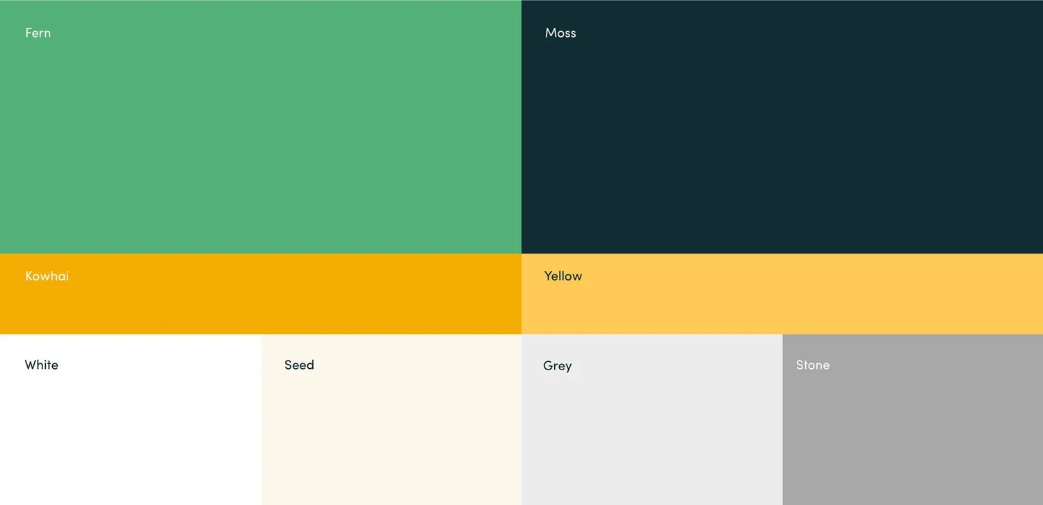
A limited colour palette and simple typographic system future-proofed the brand and allowed Nurture to utilise sustainable branded templates.
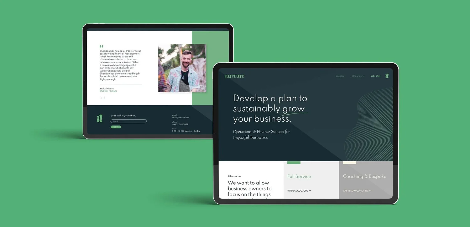
Bringing client testimonials to the forefront of their website celebrates Nurture’s existing success, builds trust and helps position Nurture as an Aotearoan venture
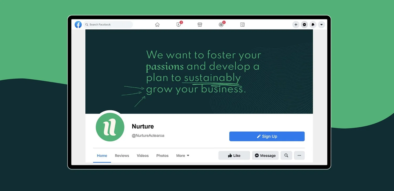
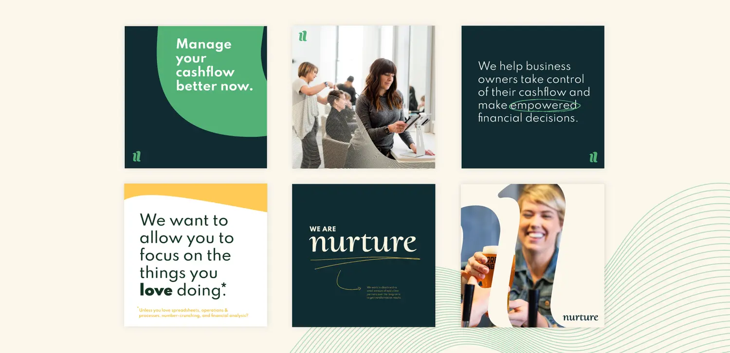
Beyond website, utilising your social channels to connect with your audience is not to be underestimated! We made sure Nurture was set up with a dynamic and adaptable template system to create an unlimited amount of social posts, empowering the team to take ownership of their communication, while remaining confidently on-brand.
We can’t wait to see what the future holds for the team at Nurture!
If you want to free up time to focus on the things you love doing, then let Nurture do the number crunching, financial analysis and operations for you. Obvious do! Visit Nurture.kiwi.
“The team at Obvious took the time to properly understand me, my goals, and what I was hoping to achieve with my business rebrand. The whole process was straight-forward and the end result is absolutely awesome. We’re chuffed with our new brand and identity!”