
Brand refresh for GrabOne
GrabOne · Brand Strategy / Tone of Voice / Typography / Creative System · 2025–2026 Relaunch under Paradigm Group
Restoring an iconic Kiwi brand — and the trust that came with it.
15 yrs
of NZ brand equity restored under Paradigm Group ownership
Mar 2026
re-launch with rebuilt brand and creative system
4
tone-of-voice qualities: Warm · Bright · Intelligent · Advocating
10+
duplicable banner templates + 5-screen Apple App Store system
GrabOne is one of the most recognised consumer brands in New Zealand — fifteen years of national presence, hundreds of thousands of engaged Kiwis at its peak, and a public closure that left the goodwill intact and the platform dark. In March 2026, Paradigm Group acquired the brand and brought it back. We led the brand work that brought it back well.
GrabOne re-entered the New Zealand market on 3 March 2026 under Paradigm Group ownership. The brand carried significant recognition and meaningful goodwill. It also carried the weight of a public closure, unredeemed vouchers, and customer scepticism that was understandable and earned. The strategic task was not to pretend none of that had happened. It was to demonstrate, in every touchpoint, that the new GrabOne was different from the one that closed — not just in ownership, but in commitment, quality, and execution.
Paradigm Group brought us in as Group Brand Director on the relaunch. The starting position was a brand the country still knew, a logomark that had drifted into the visual conventions of the discount-bin category, a tone of voice that no longer matched the platform’s ambition, and a type system built on a perfectly capable Austrian sans-serif with no particular New Zealand provenance. The opportunity was to rebuild GrabOne as a curated, considered, distinctively Kiwi brand — and to do that quickly enough to meet a March 2026 launch date.
The work we delivered between late 2025 and March 2026 covered the full relaunch system: a brand strategy document anchored in the Window of Opportunity concept, a complete tone of voice guideline grounded in four defining qualities — Warm, Bright, Intelligent, Advocating — a Wellington-made typographic foundation, design briefs for the website banner library and Apple App Store screens, and creative direction across the early partnership activations including the HelloFresh media plan. The case study below walks through the work, chapter by chapter.
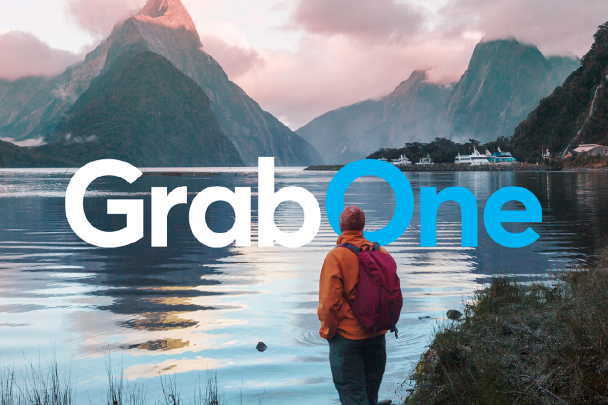
A brand worth bringing back
The strategic case for restoring GrabOne, not relaunching it.
GrabOne is not a new brand. It is one of the most recognised consumer marketplaces in New Zealand, with fifteen years of presence and a peak audience that, at scale, encompassed hundreds of thousands of engaged Kiwis. The first strategic decision Paradigm Group asked us to help make was the most consequential: do we relaunch this as a fresh brand, or do we restore the brand the country already knows?
We argued for restoration. The brand equity was real and worth protecting. Most relaunching businesses would give a great deal to acquire what GrabOne already had: national name recognition, a customer database in the high six figures, and a category position the market still associated with the brand. The cost of starting from zero — paid acquisition, brand-building media, the years required to seed a new name into common usage — was substantially higher than the cost of doing the harder, more careful work of bringing a known brand back well.
Restoration meant more than keeping the name and the logomark. It meant being honest about what had happened, building a brand that visibly took quality more seriously than the previous incarnation, and accepting that trust would have to be earned back transaction by transaction. The brand strategy document we delivered to the Paradigm Group leadership team in March 2026 made the case directly: GrabOne’s brand equity is worth protecting, the brand’s strongest asset is its ability to frame local deals as genuine discoveries rather than desperate discounts, and a clear, consistent, creatively coherent presence is the most efficient path back to relevance.
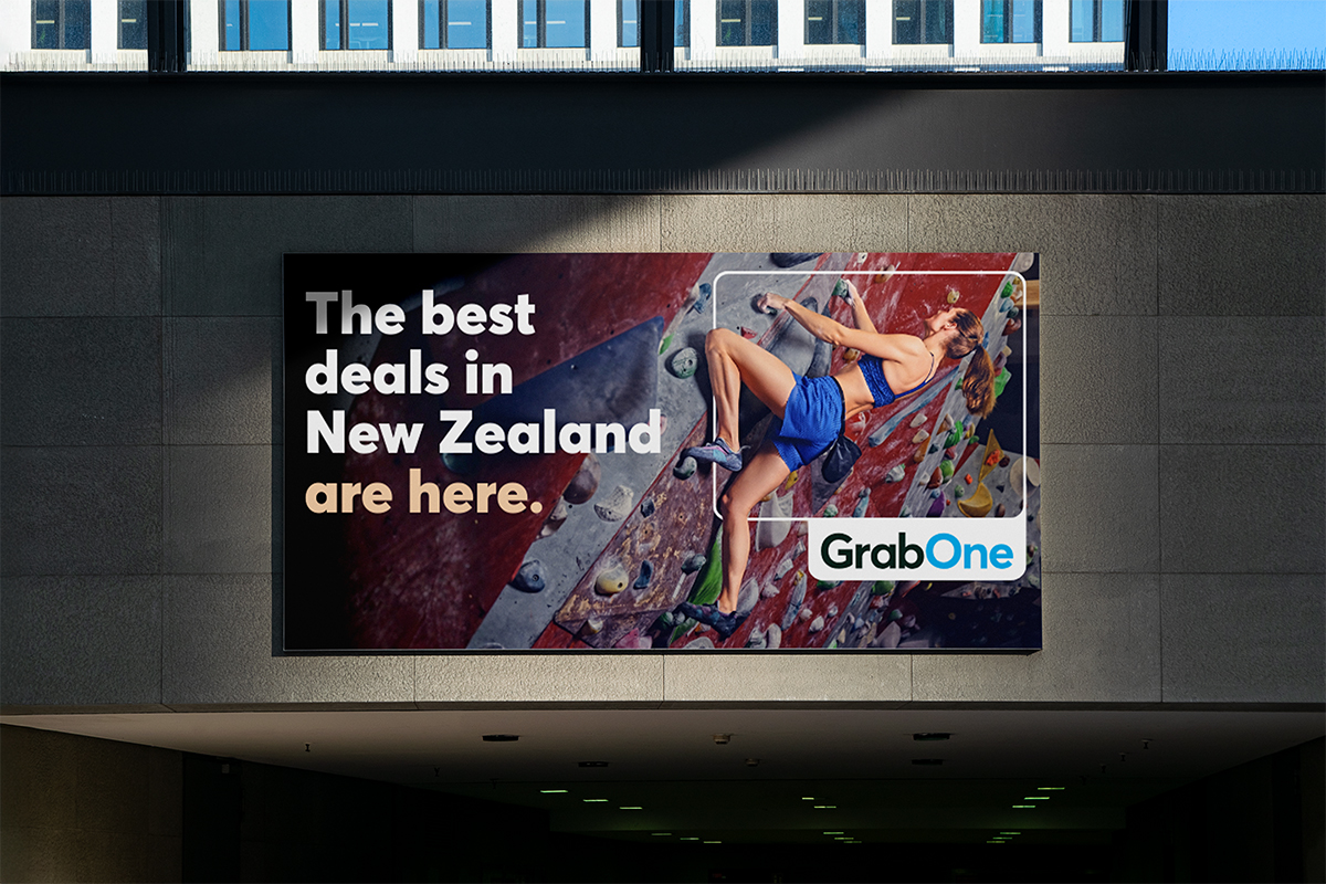
A brand position, and a window to look through
The Window of Opportunity, and why the deal isn’t the destination.
GrabOne’s brand position is built on three words that do real work: curated, local, opportunities worth taking. Curated is the promise to customers that they will not have to wade through noise to find a deal that matters — and the promise to merchants that being on GrabOne means something, because not everything gets on. Local grounds the platform in the New Zealand businesses, run by New Zealanders, that make the catalogue worth visiting. Opportunities worth taking is the emotional centre: not cheap deals, not discounted products, but things worth doing, experiencing, giving.
The visual language that carries that position is the Window of Opportunity. It operates on two levels. A window is a portal — a frame through which you see something that exists beyond your current position. In the context of GrabOne, the window is the platform itself: a view onto the local experiences, businesses and afternoons that customers might not otherwise discover. The window is also literal in the platform’s mechanics. GrabOne deals expire; the window closes. Framed through the window concept, that natural urgency becomes an invitation rather than a countdown timer — come through while it is open — which is a more honest, more considered, and more brand-appropriate way to handle the deals format than the manufactured-scarcity language the category usually defaults to.
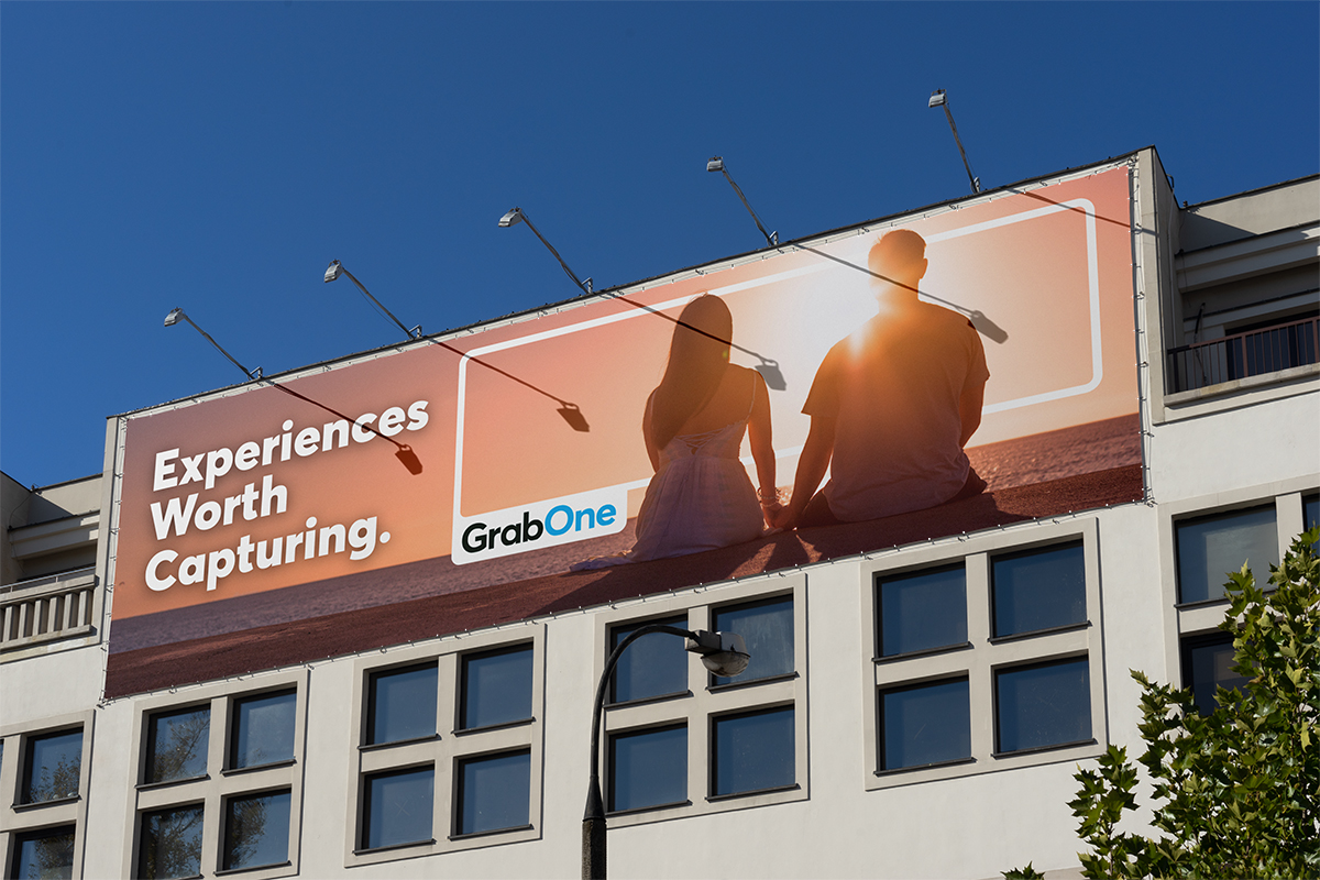
The window shows up across the system as a graphic device. It is architectural rather than decorative — a frame, intentionally proportioned, that holds the photography and signals: look here, this matters. The logo is treated as the signature on the frame, anchored to the corner in lockup like a brand sign-off on outdoor advertising. The frame frames the opportunity. The logo signs it. Together they communicate that GrabOne is the curated window through which quality experiences become accessible — which is the brand strategy, in a single visual gesture.
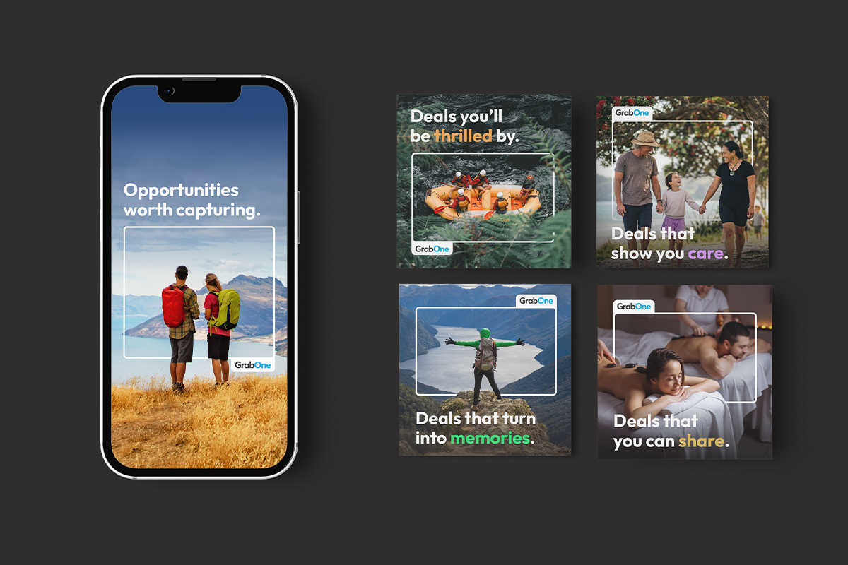
Warm, Bright, Intelligent, Advocating
A tone of voice that sells without ever sounding like it is selling.
GrabOne is, structurally, a promotional platform. Every deal description, every email subject line, every push notification is in some sense an advertisement. That is not something to minimise or dress up. It is the brief. The job of the tone of voice work was to make GrabOne the country’s best-written promotional brand — to give a daily-deals platform a voice that sounded like a person who knew the good stuff, not a marketer running a clearance.
The 2026 Tone of Voice guideline document we delivered defines GrabOne’s voice in four words. Warm — we write like a real person speaking to another real person; no corporate distance, no committee-approved hedging, no pretending to be anything other than a brand that cares about the people it is talking to. Bright — we write with energy and clarity, sentences that move, openers that earn attention. Intelligent — we respect the audience; Kiwi consumers can smell a fake bargain and recognise a tired superlative, so we give them the right detail rather than all the details, and trust them to make a good decision. Advocating — we are unapologetically promotional, but we promote through pull rather than push; we make the case with evidence and insight, not adjectives.
The same document holds a list of words and phrases GrabOne never says. Game-changer. Cutting-edge. Don’t miss out! Amazing deal! Three exclamation marks in a single piece of content. Anything that sounds like it came from a corporate template. Below that is the te reo Māori section — guidance on how the brand uses te reo with care and intent, with macrons treated as part of the correct spelling rather than optional punctuation, and a guiding principle that does the work in one line: if it fits naturally and enriches the sentence, use it; if it does not, leave it out. The voice work is, in practice, what gives the rest of the system its credibility. A brand strategy that lives at the level of positioning statements is not yet a brand. The voice is where it becomes one.
A messaging system the brand owns
Find One. Try One. Gift One. Share One. Grab One.
The brand’s core messaging system is built around five phrases that are at once a customer journey and a content strategy. Find One is discovery: the platform’s promise of curation, the moment a customer encounters something that makes them stop scrolling. Try One is conversion: a low-stakes, low-pressure word that gives customers permission to finally do the thing they have been meaning to do. Gift One is gifting: a reframing of the discount as generosity, particularly important to seasonal activations. Share One is advocacy: the social currency that turns a found deal into a referral. Grab One is the close — the brand’s own name as a call to action, urgency without manufactured pressure.
A structural rule governs how the phrases are deployed in copy. Each phrase appears at the end of a thought, as a standalone two-word sentence that follows a preceding line of context. Deals you’ll be thrilled by. Try One. Your window is open. Grab One. The phrase is the close, never the opener. That sequence is what gives each expression its weight: it arrives after something has been earned, not before it has been explained. It is also what distinguishes GrabOne’s messaging from the copywriting conventions of the rest of the deals category, which tends to lead with the imperative.
The system is architecture, not a campaign. Individual campaigns foreground one or two phrases while the others operate as background logic — a gift-focused campaign for the winter holidays leads with the scene and closes with Gift One; an acquisition campaign sets up what GrabOne is and what has changed, then closes the invitation with Find One. The phrases compound over time, each application reinforcing the others. The brand owns the language, and the language carries the brand.
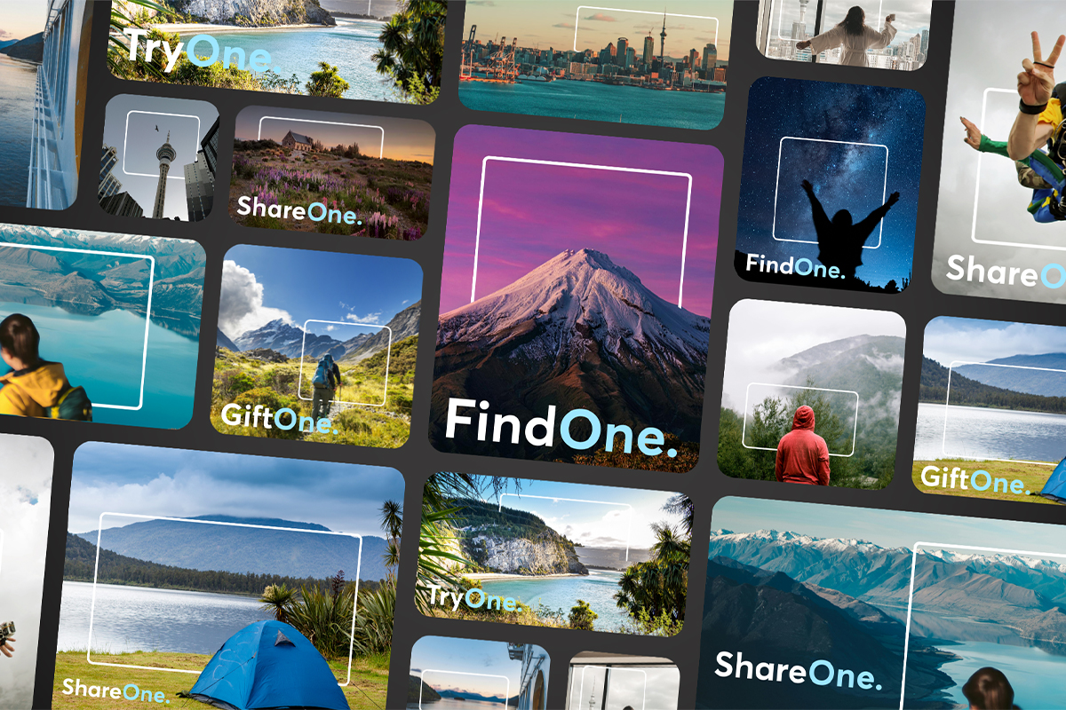
A creative system the team can actually use
Banners, App Store screens, partnership activations — and the rules that hold them together.
A brand strategy is only as valuable as the artefacts it produces. The creative system we briefed and directed for the relaunch is built around three structural rules: Sky White is the primary background and the brand breathes; Charcoal carries all body type and headlines, never harsh black; Brand Blue is a spot colour, not a fill, used like punctuation rather than wallpaper. Large blocks of solid colour read as cheap in this category. The visual richness comes from photography and typography, not from colour fields. The single most important restriction we wrote into the design brief was the ban on Brand Blue as a background — a direct response to the visual conventions GrabOne’s previous incarnation had drifted into.
The first creative deliverables were a library of ten Canva-built website banner templates (five campaign-specific, five generic) and a five-screen Apple App Store refresh. The banner library was designed to be duplicable in under ten minutes by a non-designer, with structural elements locked, layer names standardised, and the brand kit doing the colour and type work so the marketing team cannot accidentally publish off-brand. The App Store screens narrate the brand arc across five panels: the brand introduction, Find One, Try One, Gift One, and the close — the window is open, Grab One. Each screen uses the display serif at hero scale, Brand Blue as a single accent, and an action-oriented New Zealand lifestyle photograph behind the window frame.
Partnership activations followed quickly. The HelloFresh media plan, delivered in March 2026, was the first major co-marketing collaboration off the relaunch — using the Window of Opportunity device and the messaging system to frame a meal-kit deal as a genuine discovery rather than a discounted offer. A separate membership programme is in development with One NZ as the MVNO partner, with the brand work scoped to extend the visual and tonal system into the GrabOne Membership product. Across all of it, the creative rules are the same: invite, do not push; celebrate, do not oversell; and let the photography, the type, and the white space carry the weight that a fluorescent-blue background used to.
The most important thing we can do in 2026 is show up consistently. Same voice. Same quality. Same commitment. Every day, every deal, every communication. That consistency, over time, is how a brand earns its place back.— GrabOne Brand Strategy 2026, Paradigm Group
Scaling a tech-enabled consumer brand?
If you’re restoring a known brand under new ownership, building the relaunch system that has to do the trust-rebuilding work alongside the marketing, or trying to give a brand the tone, type and creative discipline its category has stopped showing — and you’d like a partner who’s been through that exact problem with one of New Zealand’s most recognised consumer brands — we’d love to talk. See GrabOne in the wild at grabone.co.nz.
Outcomes
What this enables for GrabOne
- A known brand brought back, not from zero. Fifteen years of GrabOne brand equity restored under Paradigm Group ownership in March 2026 — the country’s brand recognition kept, the closure addressed honestly, the trust earned back transaction by transaction.
- A creative system the team owns. Ten Canva-built website banner templates plus a five-screen Apple App Store system — structural elements locked, layer names standardised, brand kit doing the colour and type work so non-designers can publish on-brand within ten minutes.
- A messaging architecture the brand compounds. Find One / Try One / Gift One / Share One / Grab One — campaigns foreground one phrase while the others operate as background logic, with the phrases compounding over time.
- Partnership activations off the same system. HelloFresh co-marketing delivered March 2026; One NZ membership programme in development — both running off the Window of Opportunity device and the messaging system that anchors the relaunch.

