Kepla

A next generation brand for the future of digital marketing.
Obvious has enjoyed a long friendship with the team at Aro Digital, collaborating on a number of projects over the years. Aro Digital is a leading performance-focused digital marketing agency based in Wellington, New Zealand. Theirs was a meteoric rise, quickly becoming well known in the industry for their expertise and delivery saw a rapid growth in the size of their team.
Reflecting on the future-focused, pioneering and inventive ideologies of the product, we presented ‘Kepla’ as the name of the product
A homage to Johannes Kepler; astronomer, mathematician and philosopher; whose name is also gifted to several locations in Aotearoa New Zealand. Mapping and connecting the stars resonated with the products’ utilisation of social networks, while the exploration of space offered the a futuristic aesthetic befitting the product. Kepler spent years exploring the concept of patterns and networks through periodic and aperiodic tiling; his 350-year-old work contributed to the understanding and discovery of quasi-crystals – beautifully interconnected patterns that signified the effect of networking and connectedness.
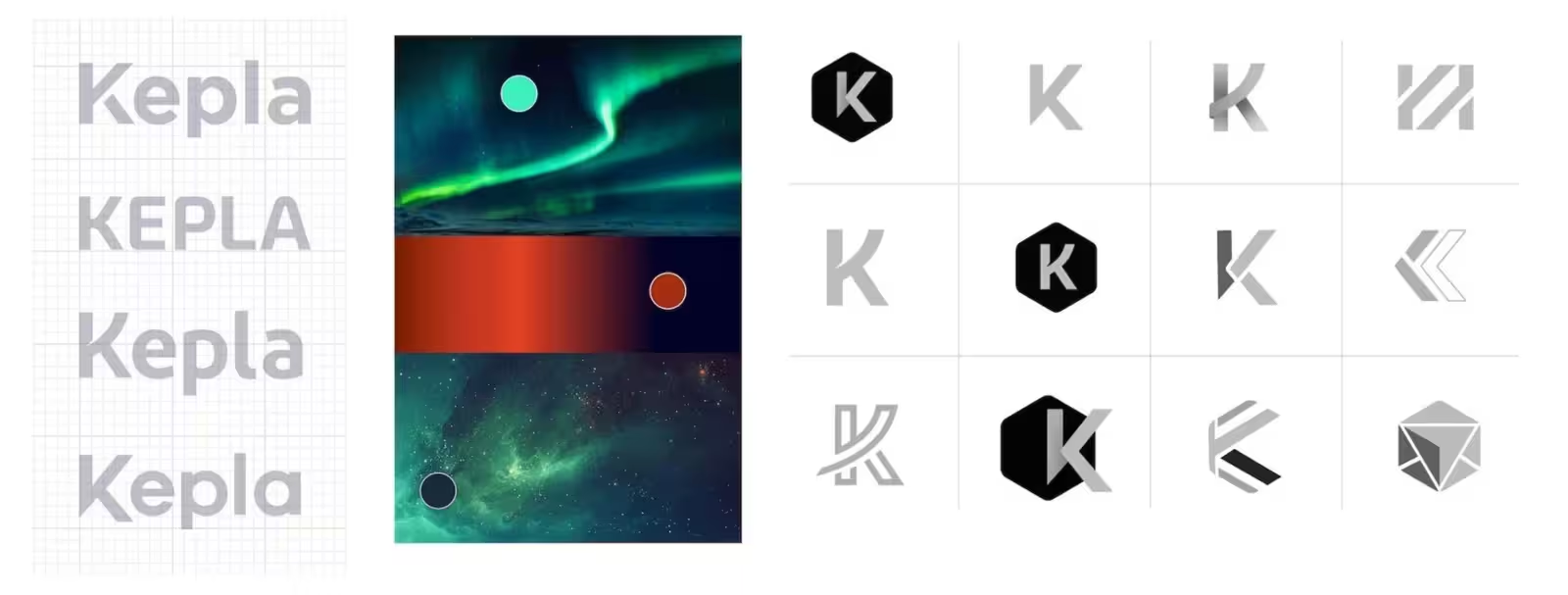
At the same time Kepla was being developed, the James Webb telescope was launched; the most significant development in exploring deep space since Hubble.
Inspired by the telescope’s iconic tessellating mirrors; we introduced hexagons and their connected vertices to represent connected social networks.
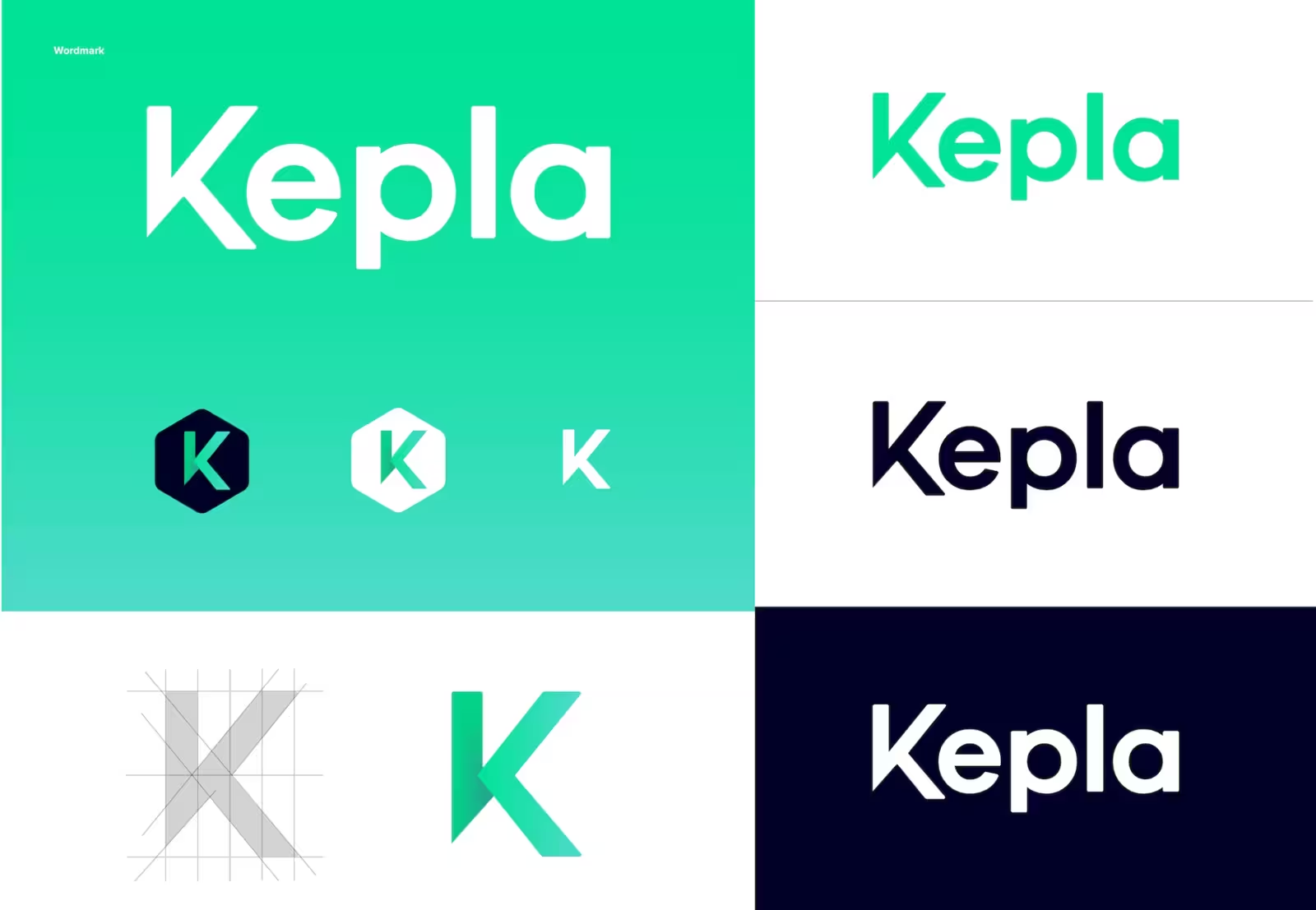
Kepla has a custom wordmark (which exists as the primary logo) as well as an associated brand icon.
Each letter of the wordmark holds a nice balance of soft corners and sharp edges and these subtleties reflect the tonal balance we have worked to achieve throughout the brand of future focused innovation mixing with a friendly and charming social platform. The customised ‘K’ aligns with the concept of networking and interconnection with the visual flow moving from the smallest point out in all directions.


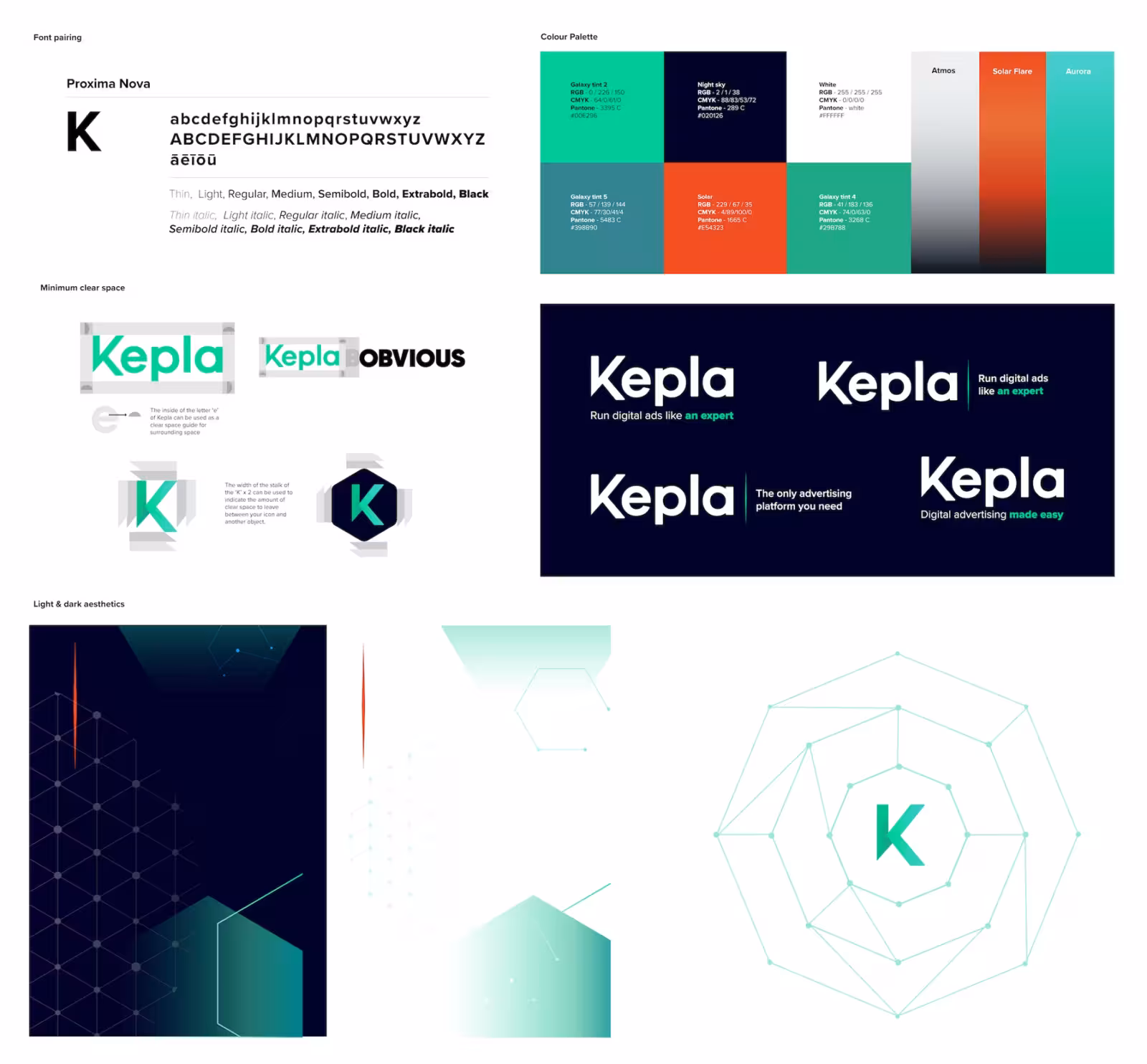
The colour palette designed for Kepla was both informed by strategy and thematically inspired by our conceptual direction of space exploration.
It was important for Kepla as a brand to stand out from the noise of competition with a lot of Facebook blue associated brands.
Through our research we determined that the vibrant green would stand out, had positive connotations, felt friendly and engaging whilst also aligning with a galaxy aesthetic and the idea of network growth that we could pull further colour inspiration from. The final palette provides a range of contrasting colours that enable both dark and light aesthetics to appear friendly and engaging both throughout the platform itself and brand and marketing material. The use of contrasting colours allows for versatile application across Kepla reporting and analytics whilst staying within the intended colour scheme.
We chose Proxima Nova as the primary font pairing. Not only is it considered as one of the best web fonts but is incredibly versatile and can be used through most typographic solutions from body copy through to graphic statement headings. It pairs nicely with the wordmark whilst feeling modern and timeless but also incredibly accessible which was very important for the product.
We’re extremely proud of the visual identity. It’s bold and confident and captures the spirit and pioneering ambition of the team behind it.

“Obvious connected instantly with what we were trying to achieve as a business, guiding us down a path of discovery and exploration, followed up with a plethora of inspiration and ideas that were then refined over time. If anyone is looking to create a brand that is not only unique, but has a clear sense of longevity and purpose, I’d look to the team at Obvious to do it proper justice. They are clearly the best in New Zealand.”

