
Brand identity for Te Mahi Ako
Te Mahi Ako · Skills Active Aotearoa Sub-Brand · Tertiary · Workforce Development · Te Ao Māori-led Brand Identity · 2022 — Present
A new name, a new brand, a kaupapa of empowerment for Te Mahi Ako — Skills Active Aotearoa’s work-based learning sub-brand for Aotearoa’s active industries.
Aug 2022
Te Mahi Ako Brand Book delivered — discovery to deploy-and-sustain
9 sectors
served — exercise, snowsport, outdoor recreation, aquatics, performing arts and more
7 values
in te reo Māori articulated: Tika, Manaakitanga, Kotahitanga, Kaitiakitanga, Aroha, Rangatiratanga, Wairuatanga
126 pp
brand book the in-house team can return to for years
Skills Active Aotearoa needed a sub-brand that could carry the on-the-job side of its work into a new era — one that put the learner, the workplace and te ao Māori at the centre. Te Mahi Ako — literally, the work of learning — was the name that emerged. Obvious was engaged to build the strategy, the identity and the system that would let it stand on its own.
Skills Active Aotearoa has spent decades qualifying the people who make the country’s active industries work — the kaiako and instructors in recreation, exercise, sport, snowsport, aquatics, the performing arts, and the wider community recreation and entertainment sectors. The brand that carried that mahi had served well, but by 2022 it was doing too much: speaking to learners, workplaces, schools, assessors and Crown stakeholders all at once, in a visual language that had grown crowded around a single identity. Skills Active was the parent. The work-based learning side of the kaupapa needed a name and a brand of its own.
Te Mahi Ako was the name the organisation chose. Obvious was engaged as the brand partner: to run the strategy, design the identity, and build the system that a new sub-brand would need to launch and sustain itself alongside its parent. The engagement opened with a discovery survey across Skills Active’s internal team, leadership and clients; an audit of the existing brand and its market; and a brand workshop that interrogated purpose, vision, values, personality, audience and promise. The conclusion was clear. The bones of the kaupapa were strong. What was needed was a more focused brand voice, a visual identity that could stand up next to Aotearoa’s most considered te ao Māori-led brands, and a system the in-house team could actually use.
What followed was the Te Mahi Ako Brand Book, delivered in August 2022 — a discovery, ideate-and-create, and deploy-and-sustain document that captured the strategy, the positioning, the tone of voice and the full visual identity in one place. The brand that emerged is energetic and grounded at the same time: a circular brand mark built from four interlocking sections (workplaces, learners, assessors, schools and providers), a vibrant palette anchored by Bright Purple, a typographic system pairing Integral with Heldane Display, and a pattern library derived from the icon itself. Three years on, the partnership continues — across campaigns, learning resources and the annual reports cycle.
Skills Active was the parent. Te Mahi Ako needed to be its own thing.
The starting point for the work was a structural one. Skills Active Aotearoa is the transitional industry training organisation for recreation, exercise, sport and the performing arts — a non-profit that supports Aotearoa businesses, iwi and community enterprises to train and qualify their staff and volunteers. The organisation needed a sub-brand that could speak directly to the on-the-job, work-based learning side of that mahi without competing with the parent. Skills Active would continue to hold the industry-standards conversation; Te Mahi Ako would speak to the individual learner, the workplace and the kaiako.
The discovery work confirmed the opportunity. A survey across Skills Active managers, the wider team, the Obvious team and clients showed a brand that everyone agreed on broadly — Tika, Pono, Aroha as values; Fuel the fire within as a tagline — but described in inconsistent ways. The visual identity had drifted into the territory of the daring and adventurous, leaning younger and slightly male, and was beginning to feel dated alongside the more polished te ao Māori-integrated brands emerging in the sector. The strategic conclusion: strengthen the parent before you grow the sub-brand, and give the sub-brand a more focused identity of its own.
The brand workshop that followed put the new strategy on the page. The purpose statement that won the most votes — to empower individuals to grow and develop themselves to be change makers in their industries — became the kaupapa Te Mahi Ako would be built on. The vision extended from there: an adaptable and transformative organisation that recognises the potential of incorporating indigenous knowledge systems, and creates a healthy environment for all people to prosper and thrive.
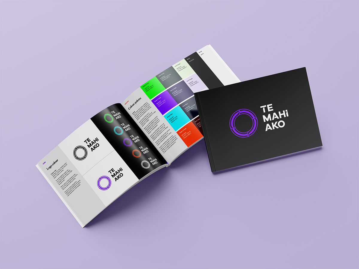
A name in te reo Māori, and a framework to live up to it
Te Mahi Ako — the work of learning — anchored the brand in te reo Māori from the first word. That choice carried obligations as well as opportunities. It meant the visual identity, the tone of voice, the patterning and the categorisation system all had to be built with te ao Māori at the centre rather than as an afterthought.
Seven values were carried forward from the parent kaupapa and given fresh definition for the new brand: Tika (integrity, dependability, trustworthiness), Manaakitanga (helpfulness, responsiveness, courteousness, flexibility for people), Kotahitanga (working collaboratively with others; unity; whānau), Kaitiakitanga (wellbeing; to be holistically well), Aroha (passion for education, activities and people), Rangatiratanga (growth, learning, valuable knowledge, adaptable leadership, achievement, innovation) and Wairuatanga (Pono; tolerance; equal and fair treatment).
The design system was developed in a co-design process with toi Māori artist Kuruho, whose conceptual thinking informed the patterning, the icon and the wider visual language. The brand mark itself is a porowhita — a circle, with no beginning and no end, symbolising the never-ending journey of discovery and re-discovery. The four interlocking sections of the mark represent the four constituencies Te Mahi Ako exists to serve: schools and providers, workplaces, assessors and learners. The breaks between them speak to the choices ākonga make in life: the pathways and opportunities that learning opens up. Mauri — the binding life force — runs through the whole.
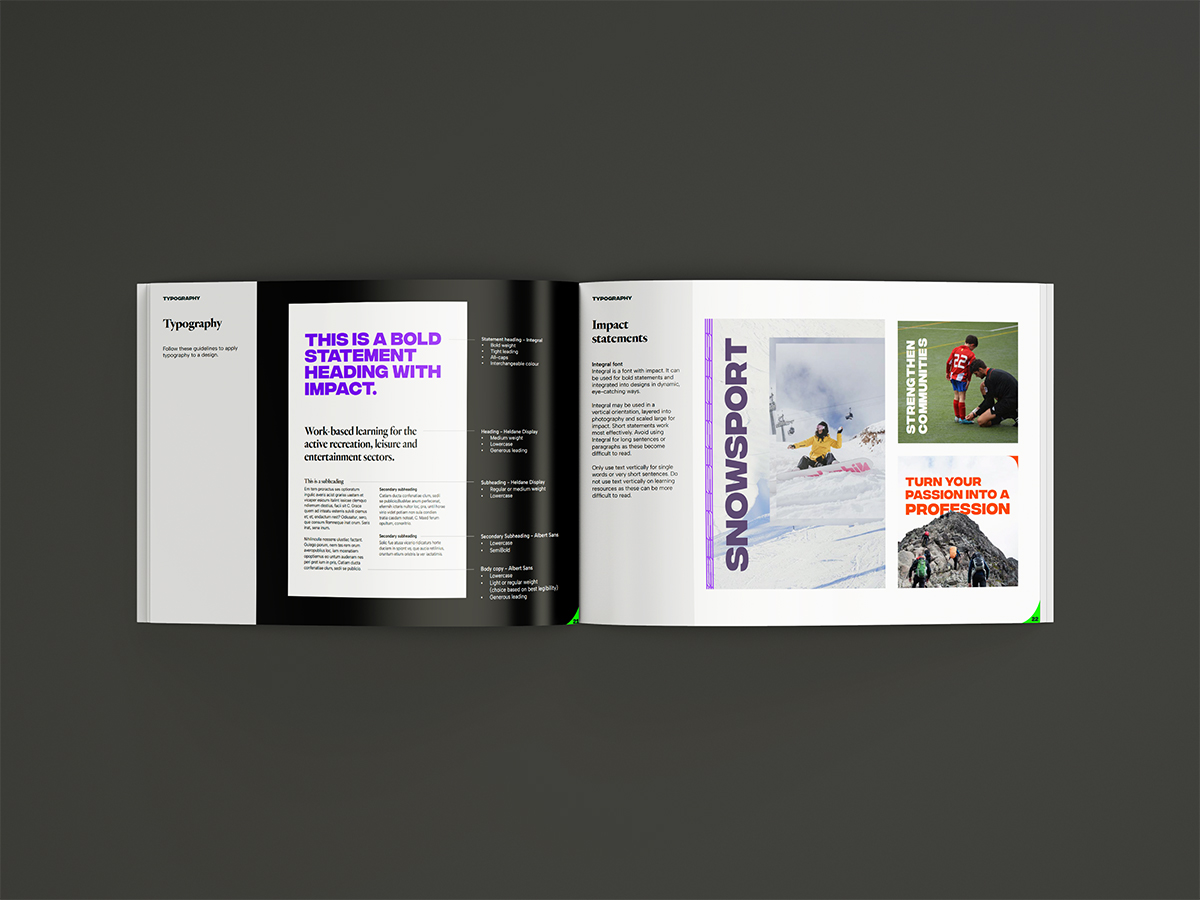
A visual system built to flex across nine sectors
Te Mahi Ako serves a wide and varied set of industries: exercise, snowsport, outdoor recreation, aquatics, multi-industry and Māori, performing arts, sport, community recreation. The visual system had to flex across all of them without splintering. The solution was a single brand mark, a single typographic palette, a single pattern library — and a colour system that gave each sector room to breathe.
The colour palette is vibrant and energetic, inspired by the passionate energy of staff and students. Bright Purple anchors the palette, supported by Bright Green, Bright Blue and Bright Orange, each with a complementary dark and soft tone for light and dark modes. Typography pairs three faces: Integral (bold, all-caps) for statements and campaign typography; Heldane Display (serif) for secondary headings and pull-quotes; and Albert Sans as the easy-to-read body face for long copy and learning resources. The brand book is explicit about the dyslexia-friendly and accessibility-aware decisions baked into the document design.
A library of linear patterns and a pathway motif, both derived from the haehae and whakarare shapes inside the icon, give the system a kinetic visual signature that can be repeated, scaled, used as a colour block or used to mask photography.
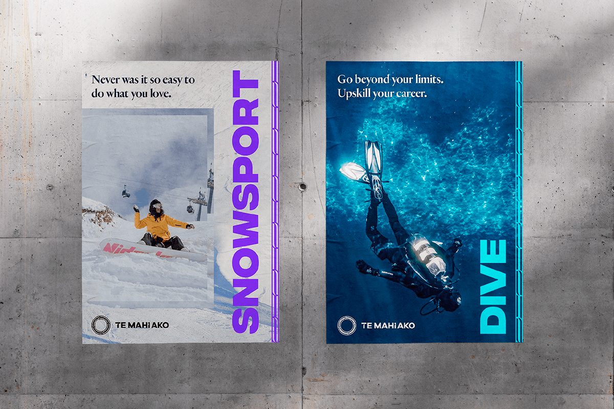
Designed to be lived in — and to grow
A brand that lives across nine sectors, four audiences, a parent organisation and a national learner base needs to be designed to be used, not just admired. The 126-page brand book runs from discovery through ideate-and-create to deploy-and-sustain, with full positioning statements, tone of voice, brand guidelines and applied examples covering letterheads, business cards, social banners, flyers, learning-resource cover pages, info books, assessment templates and merchandise.
The system was paired with corporate stationery, a PowerPoint template, document templates, a refreshed photography library and a brand video produced in late 2022 to introduce Te Mahi Ako to the sector. Three years on, the partnership has continued — through annual reports, ongoing campaigns, learning materials and refreshed creative as the kaupapa evolves. The brand book remains the through-line: the document the in-house team can return to when a decision needs to be made and the rationale needs to be remembered.

Outcomes
What this enables for Te Mahi Ako
- A brand mark grounded in te ao Māori. A porowhita (never-ending circle) built from four interlocking sections representing schools, workplaces, assessors and learners — co-designed with toi Māori artist Kuruho.
- A 126-page brand book the team can return to for years. Strategy, positioning, tone of voice and full visual identity captured in one document — discovery to deploy-and-sustain.
- A visual system that flexes across nine sectors. Single brand mark, single typographic palette, single pattern library — with a colour system that gives each sector room to breathe without splintering the identity.
- A tone of voice the in-house team can write in. Casual but not too informal, te reo Māori integrated with English, with a word bank organised around the seven values — usable day after day without an agency in the room.
Working in the public, Crown or tertiary sector?
Obvious partners with Crown entities, councils, iwi organisations, tertiary providers and workforce-development bodies across Aotearoa to build brands and communications that are grounded in te ao Māori, accessible to the communities they serve, and designed to be lived in by the teams who use them. From brand strategy and identity to annual reports, learning resources and campaign work — we make the kaupapa obvious.

