
Brand strategy and campaigns for Whitireia and WelTec
Whitireia & WelTec · Tertiary Group · Wellington & Porirua · Brand Strategy · Annual Reporting · Campaigns · OOH · Photography · Te Reo Māori Design · Multi-year
A unified brand strategy for Whitireia & WelTec — two of New Zealand’s largest government-owned polytechnics operating as a single Group while each retains its own name, campuses and identity.
Multi-year
tertiary partnership across reporting, campaigns & visual identity
2 in 1
two institutions, one operational Group, one brand system
National
radio + digital reach via Weekend Warrior × StudySpy
Bicultural
Te Reo Māori design discipline across every artefact
Whitireia and the Wellington Institute of Technology (WelTec) are two of New Zealand’s largest government-owned polytechnics, serving thousands of learners across multiple campuses in the Wellington and Porirua regions. In the late 2010s the two institutions came together as a single operational group — sharing a chief executive, council, and back office — while each retained its own name, its own campuses, and a distinct identity its communities already knew and trusted. That decision set the brief for everything that followed: act as one organisation without erasing two histories.

The two names mean different things. Whitireia takes its name from the maunga that rises above the Porirua harbour and from the kupu Māori meaning the spreading rays of the sun — a name with mana and place. WelTec carries the heritage of trades, engineering and applied learning at Petone going back more than a century. Both serve audiences that range from school leavers choosing their first course, to mature students returning to study, to industry employers commissioning workforce training, to Crown stakeholders evaluating outcomes. Any brand system that wanted to hold across that span had to be more than a logo lockup.
Obvious worked with the Whitireia & WelTec Group across a multi-year partnership covering annual reporting, recruitment campaigns, out-of-home advertising, graduation and event photography, and a joint cross-platform campaign with StudySpy. The discipline running through all of it was the same: one coherent institution, two names with whakapapa, dozens of channels, and an audience that moves between them.
One Group, two names
The strategic problem at the heart of this engagement was easy to state and hard to solve: how do you communicate as one organisation when your audiences, employers, and graduates know you by two different names?
The answer wasn’t a third brand. Layering a new umbrella mark over Whitireia and WelTec would have asked prospective students, current students and industry partners to learn a name they didn’t yet trust — and would have quietly devalued the equity each institution had spent decades building in its own community. Instead, the work was to architect a system in which the two names could appear together, separately, and in supporting roles, without any one of those configurations feeling improvised.
That meant working out — across hundreds of touchpoints — when to lead with Whitireia, when to lead with WelTec, when to lock the two together as a Group, and when the organisation needed to speak as a single institutional voice (most often in Crown reporting and at the executive level). Every artefact in this case study sits inside that decision tree.
The annual report as an editorial product
Obvious produced the Whitireia & WelTec Group annual reports, working from Crown-entity reporting requirements through to printed publication. Annual reports for tertiary institutions sit in a particular constraint set: a heavily regulated structure, a demanding stakeholder set (board, government, students, prospective students, media), large data tables, and a shrinking attention span at the receiving end. The brief was to make the report actually readable while keeping every Crown reporting requirement intact.
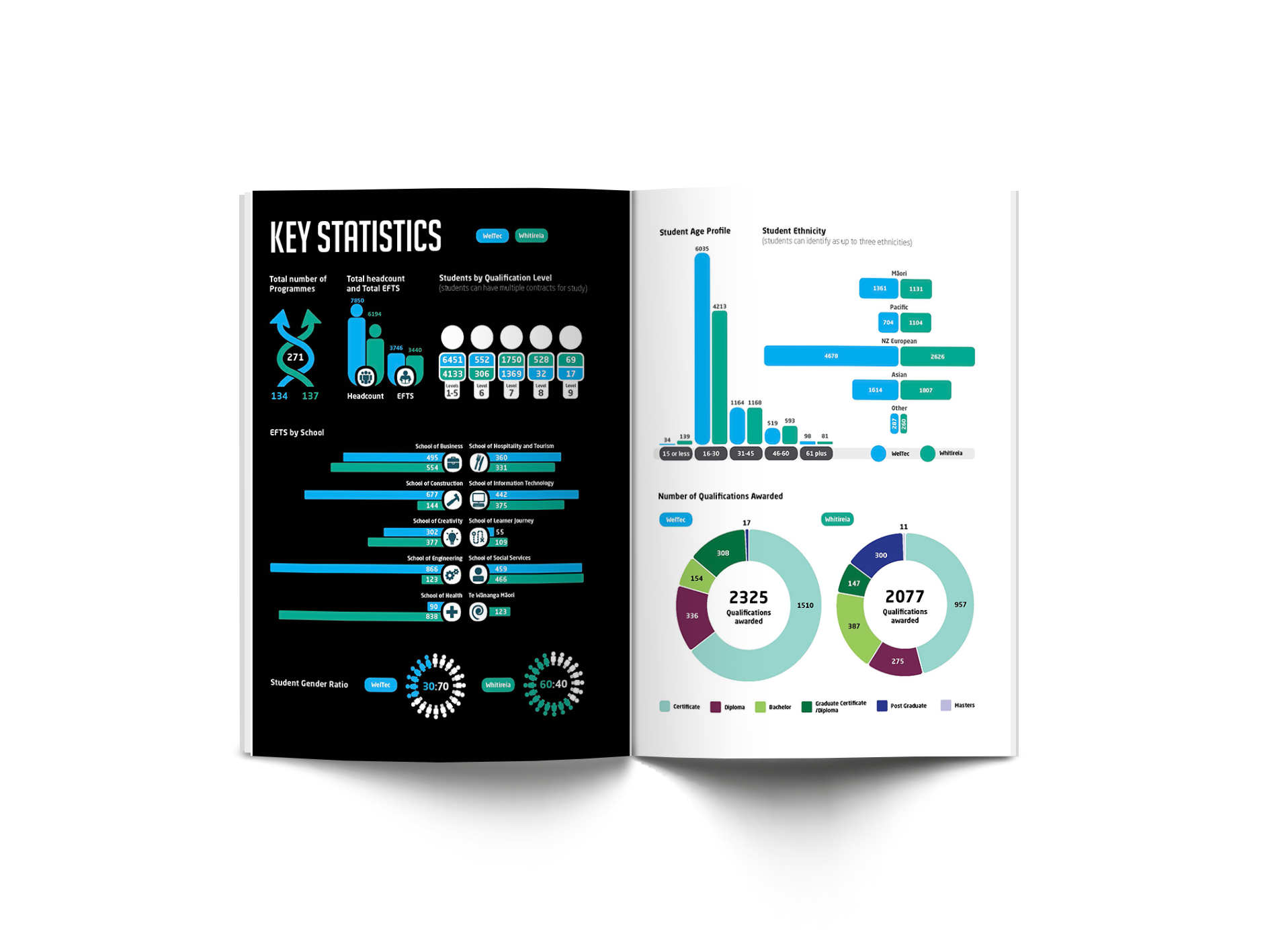
The system we built treated the report as an editorial product, not a compliance document. A strong cover concept did the strategic positioning work upfront. Infographic spreads pulled the most quotable numbers forward — student outcomes, equity figures, completion rates — so a journalist or board member skimming the document for a single statistic could find one. Long-form sections used a typography system designed for staff and stakeholders who would read cover-to-cover, with hierarchy generous enough to survive the dense financial appendices the Crown requires.
Inside the dual-name structure, the annual report was the most demanding test. A Group report has to credit the work of two institutions equally, present consolidated financials accurately, honour the contributions of both councils and executive teams, and still feel like one coherent annual story. The page system we developed gave each institution room to be visible without fragmenting the document — and gave the Group a single voice when it needed one.
Weekend Warrior — a national campaign with StudySpy
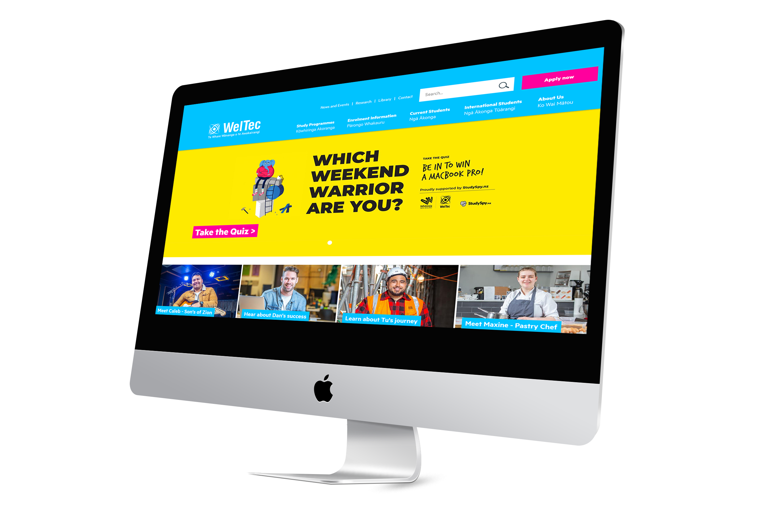
Obvious co-created the Weekend Warrior recruitment campaign, a cross-brand collaboration between Whitireia & WelTec and StudySpy — New Zealand’s most-used course-comparison platform. The campaign ran nationally on ZM radio and across the StudySpy platform: a personality-style quiz that invited prospective students to discover their “weekend personality type” and enter to win a MacBook Pro.
The strategic brief was a familiar tertiary problem. Get the right prospective students to take the moment of decision — apply, enrol — seriously, in a category where attention is fragmented and most messaging gets dismissed. The personality-quiz mechanic met the audience where they already are, fluent in the format from social media, and the prize anchored the action with something the audience genuinely wanted. Obvious produced the illustration system, the campaign visual identity, and the marketing collateral across web, social and partner placements.
Weekend Warrior is the kind of work that’s only possible when the underlying brand system is already disciplined. Because Whitireia & WelTec could speak with one voice across the campaign — and then hand off cleanly to two distinct course pages on the back end — the partnership with StudySpy could land as a single national moment without anyone needing to explain the dual-name structure to a 17-year-old.
OOH, fleet and the recruitment system
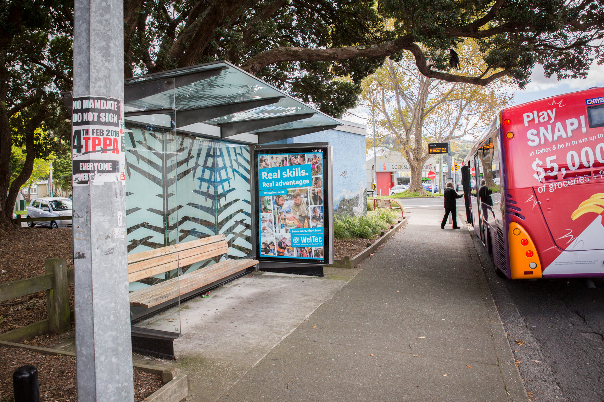
Across multi-channel recruitment cycles Obvious produced billboards, AdShells, partner-placement creative including the Westpac billboard placement, and WelTec fleet vehicle livery. The discipline across this work was less about a single creative breakthrough and more about a system that could scale: dozens of pieces, across channels and campuses, looking like one coherent institution.
That meant a small set of design decisions had to do an enormous amount of work. A consistent typographic hierarchy. A dual-lockup that read clearly at billboard scale and at A5. A photography style that could hold across the breadth of the programme offer — Business one week, Engineering or Automotive the next. And a colour and layout system disciplined enough that an AdShell at a Porirua bus stop and a vehicle livery on a WelTec ute on the motorway both said the same thing about who this institution is.
The fleet livery in particular is the kind of asset that earns its keep over years rather than weeks. A vehicle on the road every day in Petone, Porirua and the wider region is one of the most cost-efficient impressions a polytechnic can buy — provided the design holds up to that level of repetition. The system we built was designed to.
Graduation as institutional record
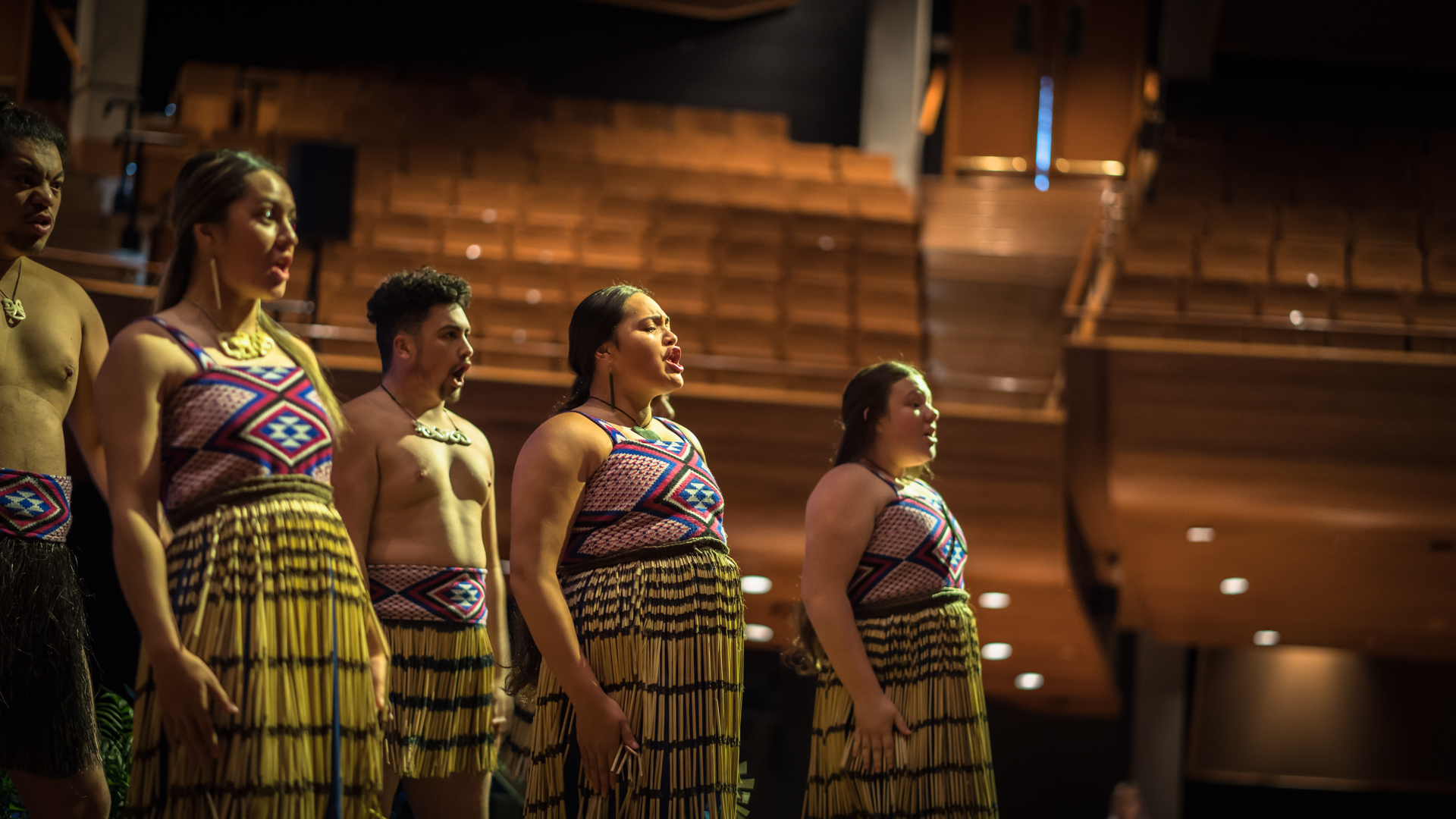
Graduation is the single most-photographed institutional moment of the academic year — and the one that has to do the most jobs. Every image has to work for the recruitment funnel (course pages, prospectus, OOH), for the institutional record (annual report, government reporting, media releases), for the families standing at the back of the auditorium, and for the graduates themselves, who will keep the photos for decades.
Obvious produced the graduation photography across multiple ceremonies and campuses, alongside hero photography for the Business, Engineering, Automotive and Trade programme pages. Working a graduation is its own discipline: long days, fast turnaround, hundreds of names on the run-sheet, and one chance to capture each crossing of the stage. The libraries built across these years now sit at the centre of the institution’s visual identity — feeding both the marketing pipeline and the formal reporting cycle from a single, coherent source.
Outcomes
What this enables for Whitireia & WelTec
- Hold across audiences without diluting. From 17-year-olds choosing first courses, through mature students returning to study, to employers commissioning workforce training, to Crown stakeholders evaluating outcomes — one system that flexes tone for each moment without fragmenting.
- Honour names with whakapapa. Whitireia — the maunga, the spreading rays of the sun — given prominence and care alongside the partner brand. Bicultural design as the minimum bar for working in the sector, not decoration.
- Design for the system, not the artefact. Annual reports, OOH, graduation photography and a national radio campaign aren’t four different briefs — they’re four expressions of the same brand decision tree, applied across years and channels.
- A brand disciplined enough to look effortless. Two names, one Group, hundreds of touchpoints, multiple years — handled as one coherent institution, with each name visible when it should be and supporting when it shouldn’t.
Working in tertiary, public sector, or large-scale recruitment?
Obvious partners with tertiary institutions, polytechnics, wānanga and Crown entities across Aotearoa to design brand systems and communications that meet the realities of Crown reporting, recruitment cycles, and bicultural design. If you’re a tertiary institution, polytechnic, wānanga, Crown entity or public sector organisation looking for a brand and communications partner who understands these realities — we’d love to talk.

